
In order to calcuate the excess mortality rate in a given week, we need to establish what death rate is to be expected.
I start by defining a baseline time period: I've selected 2010-2018 (9 years). Why not include 2019? By excluding it I can test the predicted baseline against 2019 as a sort of 'sanity test'.
Not all countries have provided weekly mortality data from 2010. Some go back much further (eg Finland data starts in 1990) and some start later (Chile's data starts in 2016). With fewer than 9 years, the baseline will be less reliable.
The mortality rate is seasonal, there are fewer deaths in Summer compared with the Winter months. This effect is most apparent in older people.
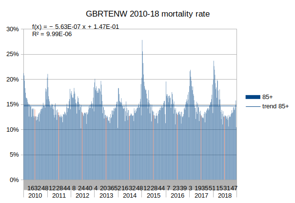
The mortality data is provided in 5 separate age groups (0-14, 15-64, 65-74, 75-84 and 85+) as death count and death rate per 100,000 population in each group. For example: in Week 26 of 2018 in England and Wales there were 3,497 deaths of people over the age of 85. This was also given as a rate of 12.58% of the population of over 85s if the same rate had continued for a full year.
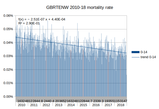
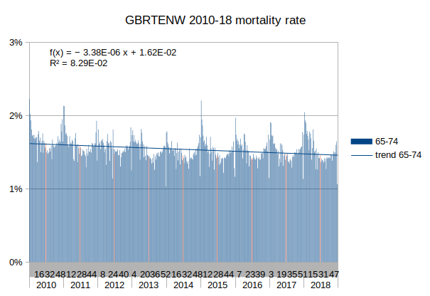
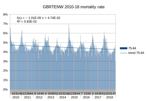
I start by calculating a best fit straight line (regression) for each age group (5 groups) and country (38 countries) from the beginning of 2010 (if available) to the end of 2018. For example: in week 26 of 2018 the straight line trend rate for over 85s in England and Wales would be 14.72%
I then calculate the difference for each group for each week from the corresponding straight line (2010-2018: up to 470 weeks). For example: in week 26 of 2018 in England and Wales we actually had a rate of 12.50% among over 85s, which gives us a difference of 2.22% below the straight line trend.
I then calculate the average differences for each week number (53 weeks) For example: In England and Wales an average Week 26 (around end June) has 0.0034% lower death rate among 0-14 year olds than the 9 year straight line average for that age group, 0.0060% lower for 15-64 year olds, 0.057% lower for 65-74 year olds, 0.42% lower for 75-84 year olds and 1.72% lower for over 85s. This reveals the usual seasonal difference between Winter and Summer weeks. We can refer to this as the weekly differences from the straight line trend.
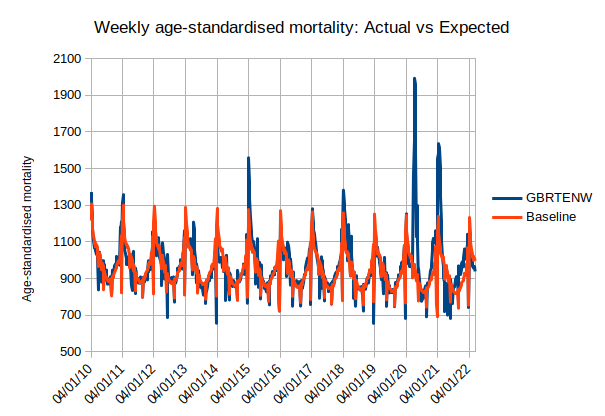
For England and Wales it looks like this:
(If you are wondering about the spike in Winter of 2014/15: It was a bad 'flu year. If the death rate had continued at the peak level for a whole year nearly 28% of over 85s would have died. It didn't maintain the peak for a whole year of course - just for a week or so. Note how the death rate for under 65s is barely affected - similar to how the seasonal mortality rate variation affects older people more than younger ones).
I then add the average weekly differences back to the straight line trend for each country (38 countries) for each week (beginning 2010 to end Feb 2022, up to 635 weeks) for each age group (5 groups). This gives an 'expected' mortality rate for each age group for each week.
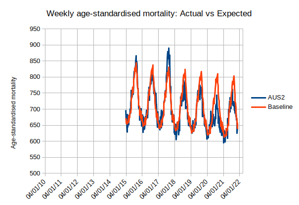
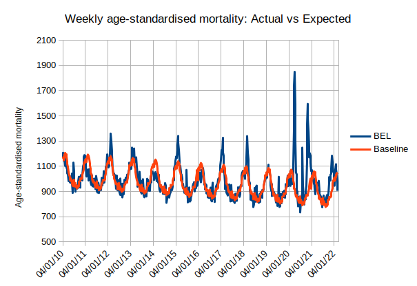
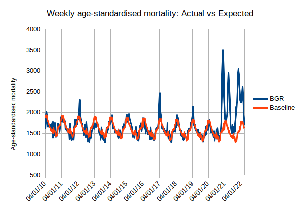
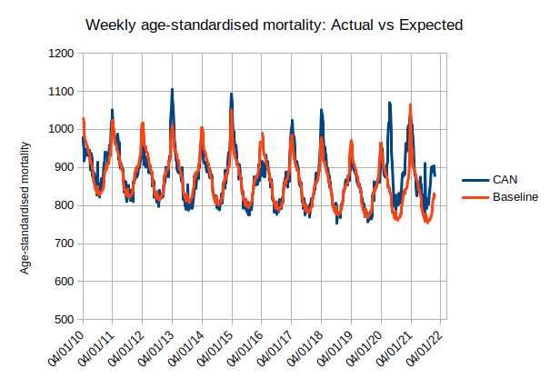
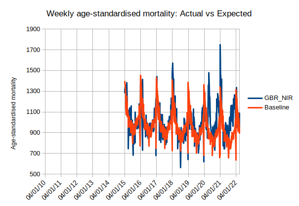
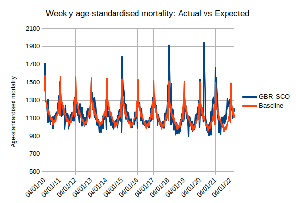
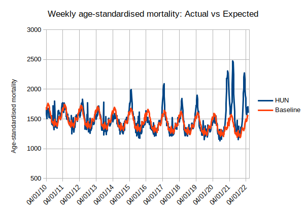
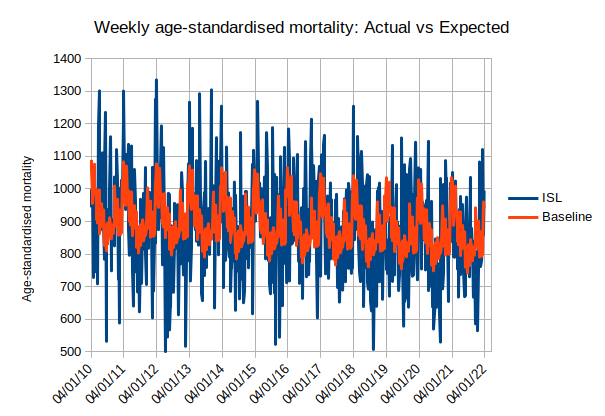
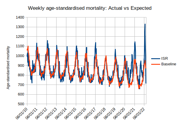
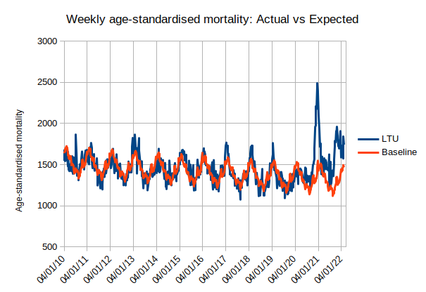
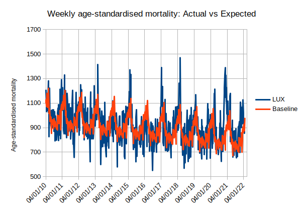
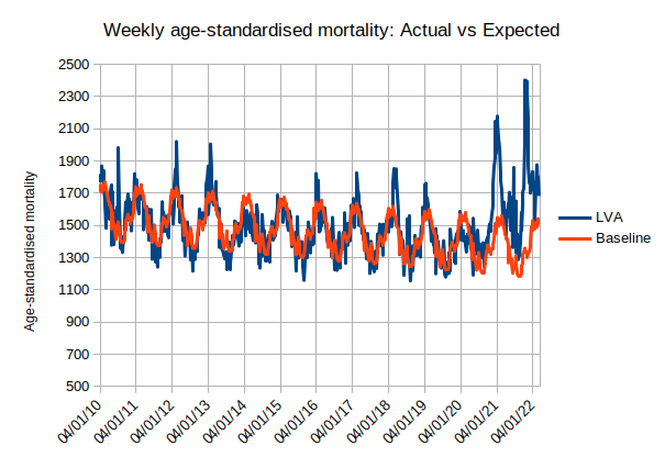
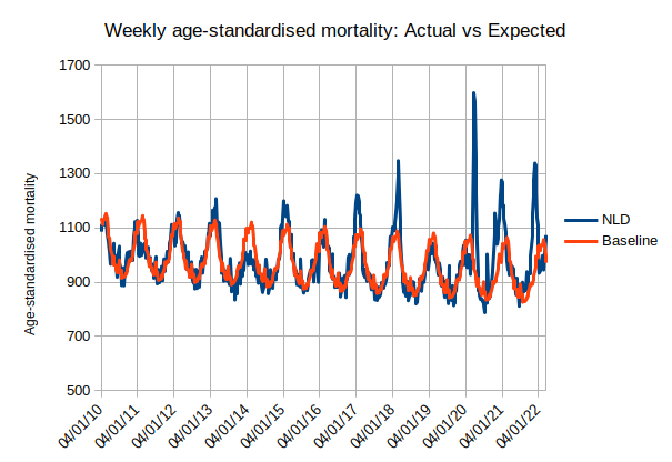
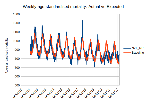
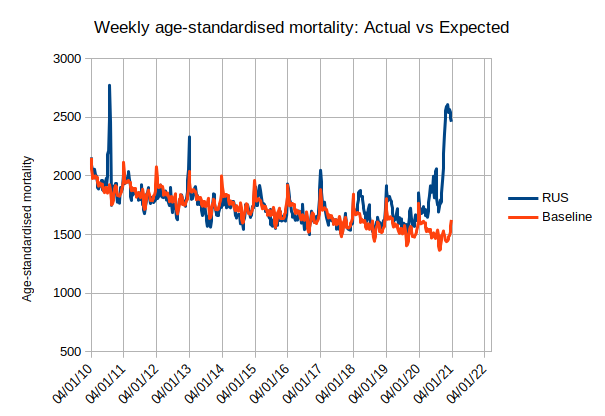
The next step is to combine, for each country, the separate mortality rates for the age groups into a single 'age-standardised' mortality rate (ASMR) for each week... and this is what we get:

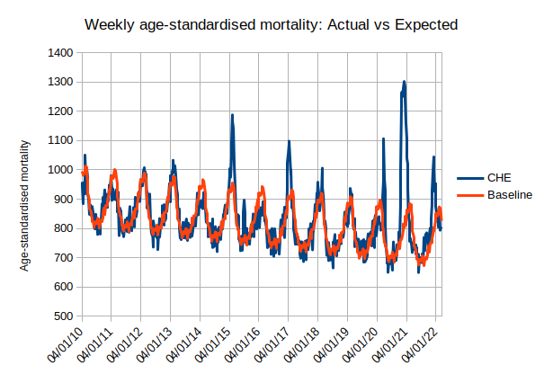
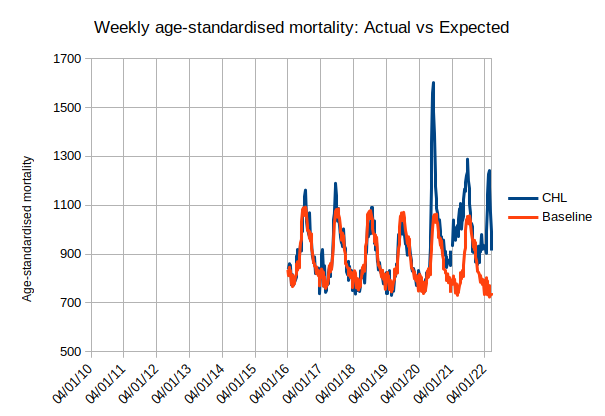
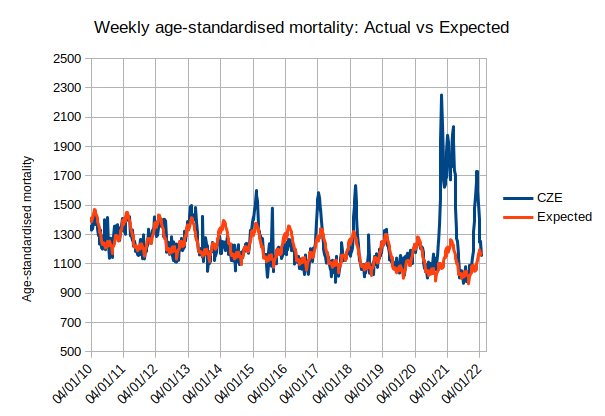

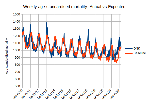
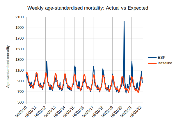
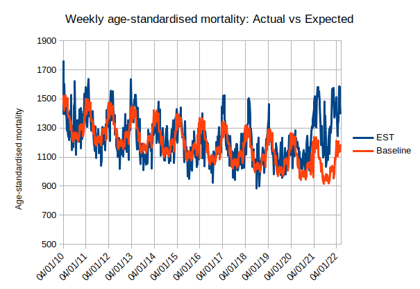
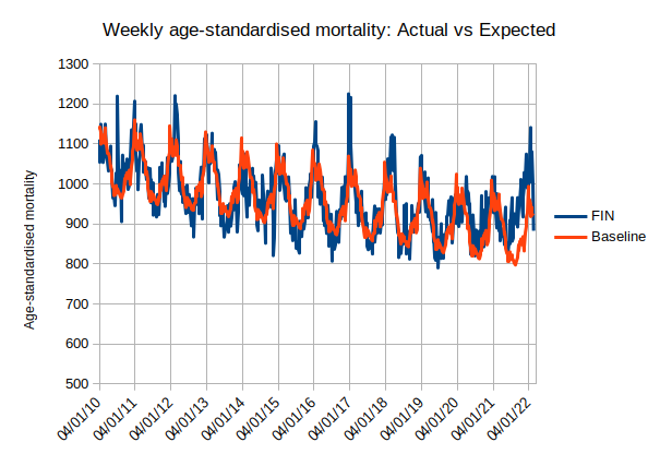
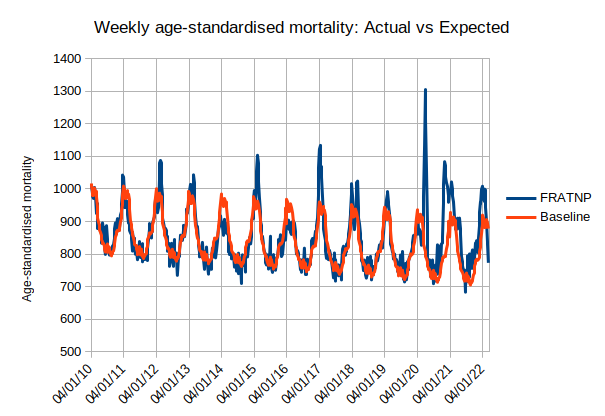


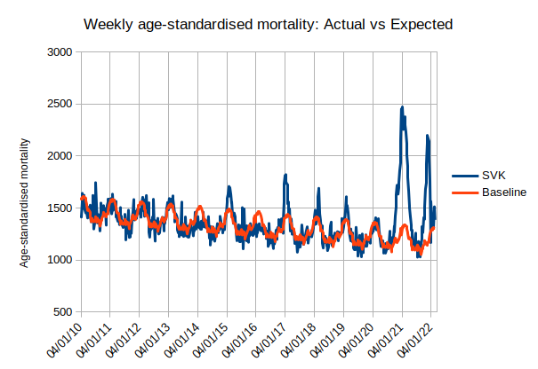
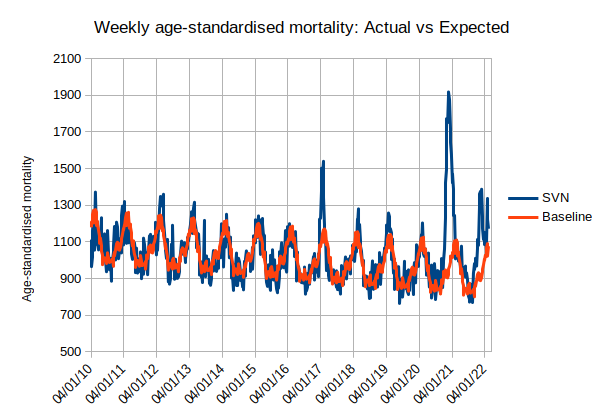
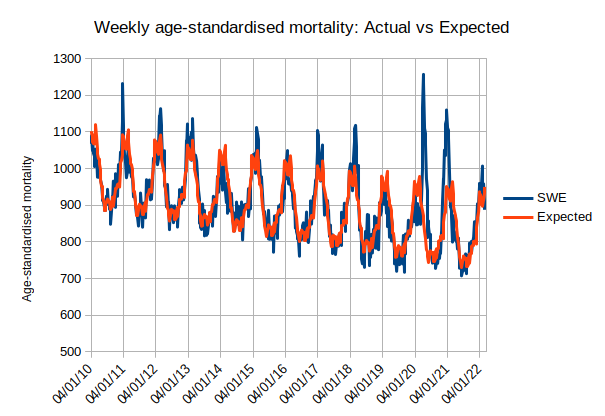
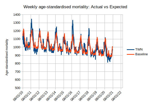
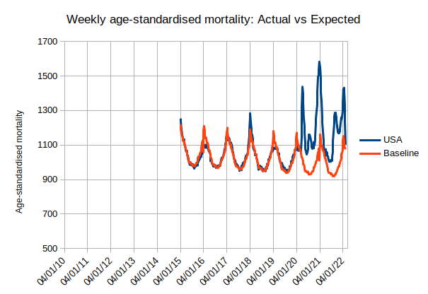
The final step is to subtract the baseline or expected value from the observed value to calculate the excess death rate for each country for each week. This can then be expressed as a percentage of the expected value. For example, for England and Wales the ASMR in week 17 of 2020 (week commencing 20 Apr 2020, first wave of the pandemic) was 1,960 (deaths per 100,000 age-standardised population) but the expected value was 979: for that week in England and Wales the mortality rate excess was 981 which was just over 100% higher than (more than double) the expected value (981 / 979 = 100.2%).
*ONS produce an annual Excess Winter Mortality figure which is based on the average all-cause death rate of the Winter months of December-March compared with the average of the death rates for the preceeding August-November and the following April-July. It cannot be calculated until the data is available up to the end of July. To me, it seems a strange definition of 'excess'.
Because of the unusual death rate in April-May 2020, the calculation for the Winter 2019/20 figure was modified to exclude 'Covid' deaths. This also avoided having negative excess Winter deaths. I look forward to the calculation of the figure for Winter 2020/21 which should be available in August 2022. Will ONS continue to exclude Covid deaths (Alpha and Delta waves in England and Wales in November-February) and will that result in negative 'excess' Winter deaths?

If you wish to comment you may email me at: SoundOfReason0 at gmail dot com. If I append your comment I will not publish your email address.