Sweden...
...and other countries
I was triggered to write this article by the number of people who hold up Sweden as an example either for or against the lockdown measures taken by most countries in response to the SARS-CoV-2 pandemic. These pro- and anti-lockdown folk often give contradictory statements without any reference to the facts; this is an attempt at fact-checking.
If you've read some of my other posts you'll know that I'm in the anti-lockdown camp. With that in mind, if you're not prepared to engage with what I write then feel free to save yourself a few minutes and stop reading now. However I do recommend you read on as you may either become convinced by my arguments or be able to refute them and thus save me from error.
Before I get into too much detail it's probably worth stating some things that I think are true:
- SARS-CoV-2 aka Coronavirus aka the Covid-19 bug is real. It's killed a lot of people and caused some long-term sickness. I don't want to catch it again.
- I don't know if the bug is a 'natural' zoonosis or a product of a laboratory. I've read both claims but it does not affect my analysis one way or the other.
- The bug was first noticed in the second half of 2019 in the city of Wuhan in the People's Republic of China. It may have started there or it may have been brought there from elsewhere. There have been stories about it being detected in other countries in samples taken in earlier 2019. Again, it does not really matter.
- The way different countries count deaths due to Covid-19 is not consistent, so comparisons between them should be treated with caution. For example, just within the UK we used two methods which were published on the government 'dashboard':
- death within 28 days of a positive SARS-CoV-2 test
- death where Covid is mentioned on the death certificate
- Even comparing all-cause mortality between different countries is difficult. You might be surprised to find there are inconsistencies in the way the dead or populations are counted. For example:
- The UK publishes most mortality data based on date of death registration rather than actual date of death. Most deaths are registered within 5 days but some are referred to a coroner's court before they can be officially registered.
- Some of New Zealand's historical data is divided between Maori and Non-Maori populations.
- Some of Germany's data distinguishes between East and West Germany. Germany was only reunited in 1990
- Some of France's and UK's data distinguishes between Civillian and Total population.
- In addition to all the above, there are differences between the methods used for annual death counts and weekly death counts. As a result it's not 'safe' to simply add up the weekly death counts for a year and call that the Annual count. However, we can estimate the annual death count from the weekly count before the annual figures are officially published.
By far the 'safest' comparison to make for any country is with its own historical data. That said, I'll break that 'rule' from time-to-time if I feel like it.
Mortality statistics are not usually published as a single number for a period of time. We normally get death data for different age groups (eg 'Under 1s', '1-4s', '15-44s' and so on up to '85 plus' or more). Of course we also need to take the death rate into consideration; There's a huge difference between the deaths of 100 over 85's from a population of 1,000 (10%) or 100 deaths out of a population of 10,000 (1%). A straight comparison of death count between USA and Luxembourg would be ridiculous.
All of the countries I'll consider publish annual and weekly mortality statistics into the Human Mortality Database (https://www.mortality.org/Home/Index); China is not one of them. Some countries have already published their annual stats for 2021 and others have yet to publish stats for 2020. For all countries I have to try to estimate their recent annual stats from their weekly data. If I don't have reasonably up-to-date annual or weekly stats and a decent overlap between annual and weekly data on which to base the estimate then I don't include that country. Russia is an example of this - their annual stats only go up to 2014 and their weekly stats go to the end of 2020; a calculated trend would be only marginally better than a guess.
To derive a single number for the mortality rate for each country for each year, I calculate the 'Age-Standardised Mortality Rate' (ASMR) based on the 'European Standard Population 2013'. Essentially this is a method to calculate what the death rate in a country would have been if the population had been exactly 100,000 people divided into the age groups and in the same ratios defined in the standard. This is not something I made up - it's a standard method to account for the ageing of a population (among other things).
OK - I think we're ready now. Here's Sweden's ASMR from 1999 onwards.
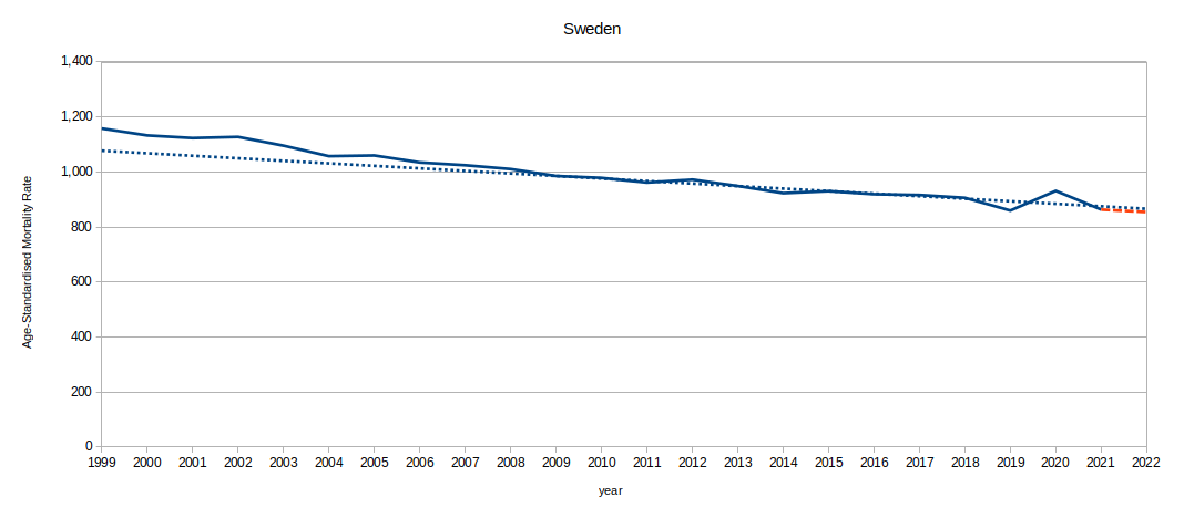
Things to note:
- Sweden's annual data actually goes back to 1751 - this is a tiny fraction of it - they're really good at record keeping.
- The dashed-red line is my estimate of what their annual death rate for 2022 will be, based on their published weekly stats so far.
- The dashed-blue line is the overall trend based on the decade 2009-2018. If you squint then maybe the reality line is flattening out slightly in the second decade?
- Note the dip in 2019. It seems there were unusually few deaths in 2019.
- On average for 2019 to end-May 2022, Sweden's ASMR was 0.13% below its expected trend.
- In the 'spike' in 2020 the ASMR was lower than the value for 2013. The ASMR was higher every year prior to 2013.
...and here's Norway's ASMR from 1999 onwards.
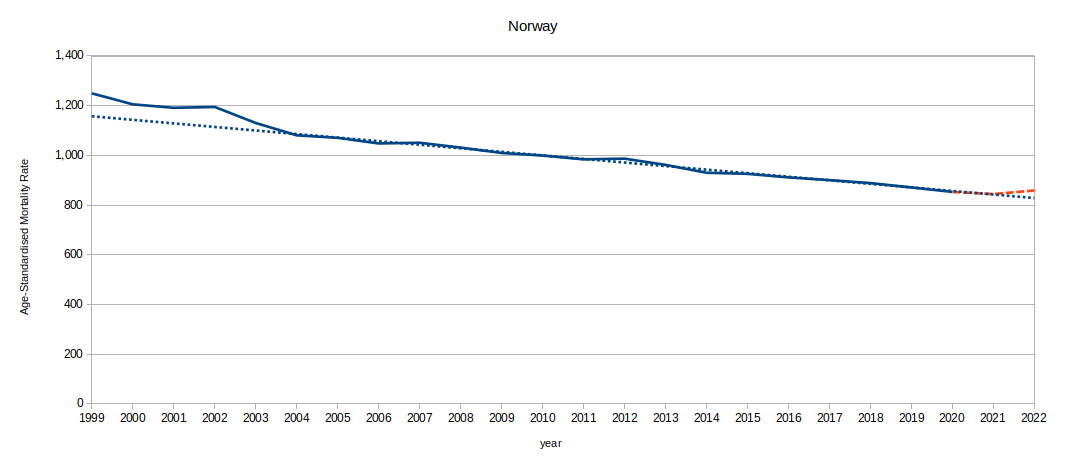
Things to note:
- Norway's annual data goes back to 1846 - they're good at record keeping.
- The dashed-red line is my estimate of what their annual death rate for 2021 and 2022 will be, based on their published weekly stats so far.
- 2022 looks like it's worse than trend so far.
- On average for 2019 to end-May 2022, Norway's ASMR is 0.83% above its expected trend.
- Norway's worst year so far during the period 2019-2022 was in 2019. Every year prior to that was worse.
...and here's Denmark's ASMR from 1999 onwards.
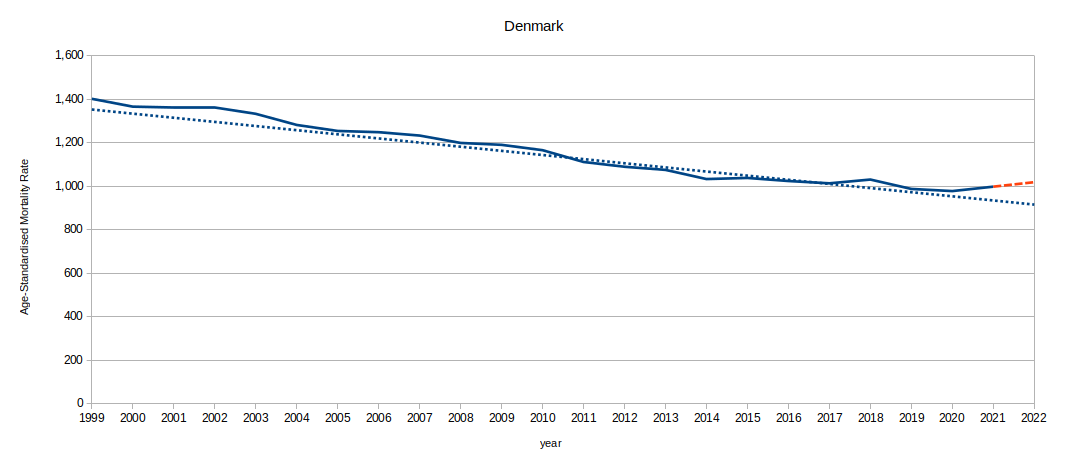
Things to note:
- Denmark's annual data goes back to 1835 - they're good at record keeping.
- The dashed-red line is my estimate of what their annual death rate for 2022 will be, based on their published weekly stats so far.
- 2021 and 2022 look like they're getting worse, not better.
- On average for 2019 to end-May 2022, Denmark's ASMR is 5.44% above its expected trend.
- Denmark's worst year so far during the period 2019-2022 was in 2022. The ASMR in 2018 was worse.
In a nutshell, mortality rates in Sweden and Norway have averaged about normal though Norway's seems to be edging up. Denmark has fared a quite a bit worse.
OK, I'm now going to break my rule. Here's a chart comparing Sweden and all its neighbours.
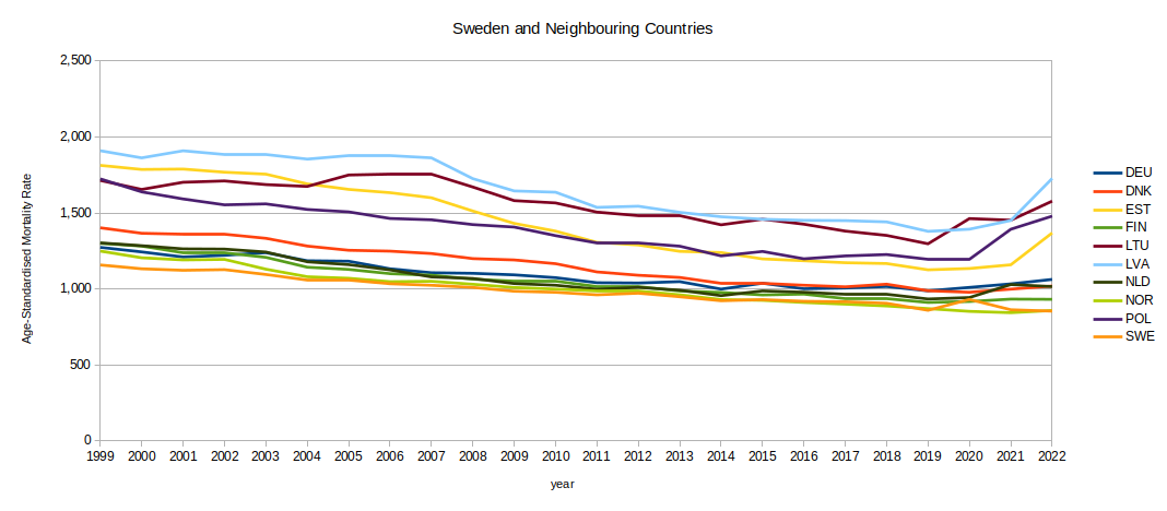
Things to note:
- Try not to compare the ASMRs for each year - just look at the shapes. Yes, Sweden's ASMR is lower than most but I don't know if all the countries are counting deaths in the same way. Try to focus on the change within each country's time series instead.
- They all seem to be having a worse time in 2021 and 2022 than in 2020 - except Sweden.
I know I previously emphasised that I should not be tempted to compare the results between countries - but the temptation is too great for me. I am prepared to evaluate how badly each country has done as compared with its own history and then compare and rank that value with other countries'.
Here's the chart that Brits have been waiting for:
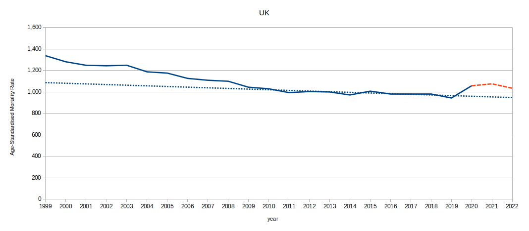
Things to note:
- The UK's annual data goes back to 1922 which is just after the partition of the island of Ireland.
- The UK's figures for 2020-2022 are considerably higher than its own trend - but not worse than the rate in 2008 and before.
- The UK's ASMR since 2019 is 7.13% higher than its long term trend.
- The UK's worst ASMR during the period 2019-2022 was in 2021. The ASMR in 2008 was worse.
- Yes. Sweden seems to have done better than the UK.
So why pick on Sweden for comparison?
Many anti-lockdown folk will tell you that Sweden didn't lock down like other countries and fared better. Pro-lockdown folk may say that Sweden fared worse than its neighbours and anyway did lockdown eventually. Both statements are true - but only partially.
- If we compare the reported rate of deaths due to Covid between Sweden and neighbours we see a different story to the all-cause ASMR:
- Sweden reports 19,402 deaths due to Covid (1,896/million of population).
- Denmark reports 6,774 deaths (1,161/million).
- Norway reports 3,834 deaths (696/million).
- UK reports 186,087 deaths (2,711/million). I know the UK is not a neighbouring country for Sweden, but I'm a Brit, so I'm interested.
- In 2020 Sweden had a greater spike in ASMR (all-cause death) than Norway (ie it was worse). Since then Norway and other neighbours have fared worse.
- In his excellent book 'Covid: Why most of what you know is wrong', Dr Sebastian Rushworth (a medical doctor in Sweden) points out that although Sweden's government recommended lockdown-like behaviour, their Constitution did not permit them to enforce it. Instead the population mostly followed the advice voluntarily - which strikes me as the way other supposedly civilised countries should have done it.
- The Blavatnik School of Government at Oxford University have published research comparing the stringency of lockdowns and similar restrictive measures for various countries around the world. Using this measure Sweden's stringency score ranked 16/34 in 2020 and 25/34 in 2021. Norway's ranking was 28 in 2020 (less restrictive) and 21 in 2021 (more restrictive).
Sweden's government suggested certain behaviour and passed some laws to help the people cope (eg to prevent people losing pay if they took sick leave). The Swedish people mostly went along with the recommendations. By the measure of all-cause mortality Sweden has done no worse than any of its neighbours and better than many. I'd call that a success though others may think that Sweden would have done even better with a 'proper' lockdown.
It also looks like reported Covid-19 death count or rate is a very unreliable measure of all-cause mortality. Either the difference is due to lockdown causing some deaths or it's just wrong to rely on a bunch of bureaucrats' definitions (different countries, different definitions) of what constitutes a 'Covid death'. I think the latter is true - but that does not mean that I think the lockdowns were harmless.
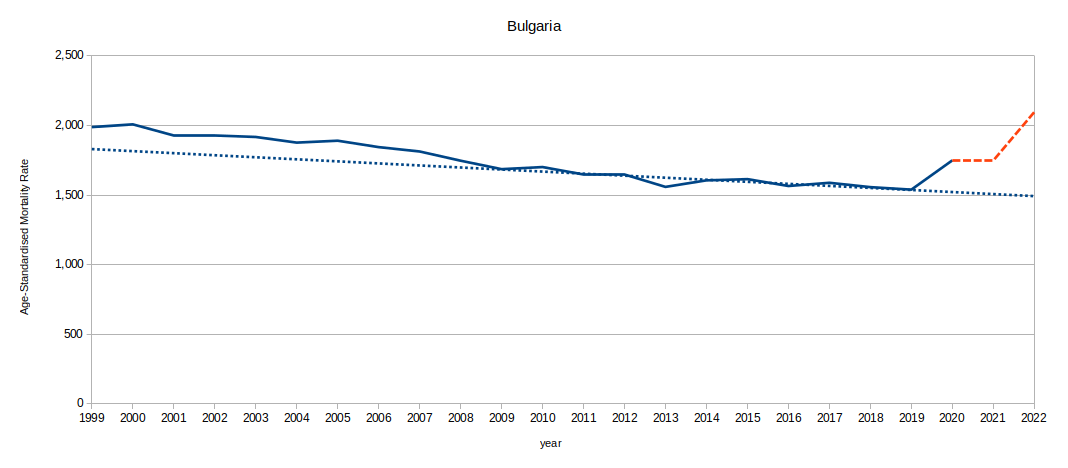
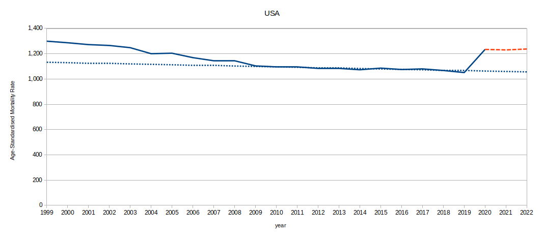
So what about other countries that have fared even worse than us in the UK? Bulgaria is the unfortunate front runner at 13.90% above trend (5,479 reported Covid deaths/million population; ASMR in 2022 is worst since 1997). Closely followed by Poland (12.95% above trend; 3,091 reported Covid deaths/million population; ASMR in 2022 is worst since 2005) and USA (11.07% above trend; 3,138 reported Covid deaths/million population; ASMR in 2022 is worst since 2003) among those that we have acceptable data for:

What about at the other end of the scale?
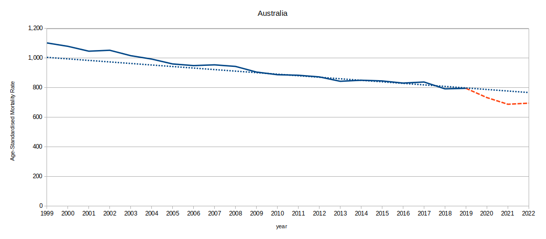
Australia is famous for adopting very strict controls (known in the media as a 'zero covid' strategy)
- It closed its borders for a very lengthy period (at times even locking out its own returning citizens)
- It imposed internal travel restrictions
- It imposed very tight lockdowns
- It acheived the greatest reduction in ASMR below trend of those countries we have acceptable data for; 6.57% below its expected trend.
- The worst ASMR in the period 2019-2022 was in 2019. the ASMR in 2017 was worse.
We need to stop and think about the above result. It appears that not only have Australia not had a high all-cause death toll during the pandemic to date, they've apparently significantly reduced their death toll below what was previously considered normal. There must be some considerable pressure to maintain the effort to keep the death rate low; surely it would be unethical not to? However, rather strangely Australia also reports 12,655 Covid-19 deaths during the pandemic so far (484/million, ~48.4 in ASMR terms). I wonder what their all-cause death results would look like if they'd been able to prevent those as well?
The weekly deaths figure for Australia is counted in a rather unusual manner: only deaths directly certified by a medical doctor are included. Deaths reported to coroners' courts are not included at all in the weekly figures which Australia has been releasing since only as recently as 2015. I therefore have had to apply a multiplication factor to the weekly figures to account for the un-reported deaths.
This raises two potential problems:
- Australia's annual mortality data only goes up to 2019; their data for 2020 or 2021 is not yet available on HMD (as at end July 2022). This means I'm trying to estimate the relationship between their annual figures and weekly figures using just 4 years of overlapping data (2015 - 2018), for other countries I have weekly and annual data covering a much wider period. This will make my estimates of their annual figures for 2020 - 2022 much less reliable.
- Australia's normal death registration rules may mean that a greater percentage of deaths are now being excluded from the weekly count than was the case up to 2019. It may also be that Australia has subtly changed their death registration rules in response to the pandemic (like the UK changed their death registration process slightly in the Coronavirus Act 2020). Either of these could mean that my estimates of their annual figures are wrong.
I suspect the figures I've calculated for Australia are lower than they should be for one or both of the reasons above - though I've used exactly the same method for other countries. The truth will out when Australia's figures for 2020 and 2021 and later are published in the HMD.
One of the other 'zero covid' countries is New Zealand. They acheived 1.22% below their expected ASMR trend and they reported 2,447 Covid deaths (489/million, a slightly higher rate than Australia).
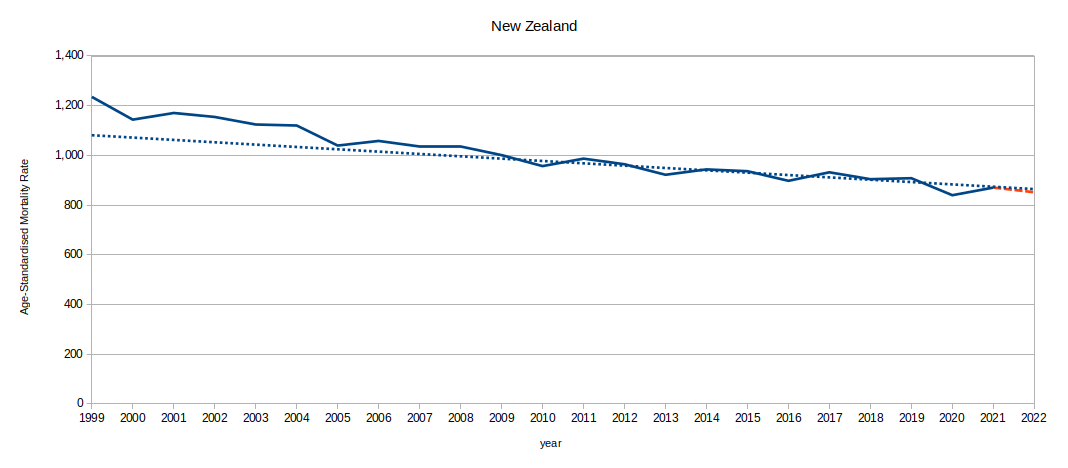
New Zealnd seems to have done as well as Sweden but with considerably more draconian restrictions - or vice versa, depending on your point of view.
If you want to improve or refute my analysis then this section might be of particular interest to you.
Potential weaknesses in the above analysis:
- To be included in this analysis countries must:
- have annual mortality data up to and including 2019 published in the main Human Mortality Database (HMD) (unfortunately, China is not in the HMD at all),
- also have weekly mortality data from at least 2016 (Chile, Greece and USA weekly data starts in 2016) in HMD's Short Term Mortality Fluctuations (STMF) database,
- also have reasonably current weekly data (Taiwan's weekly data ends at the end of 2021 - maybe I should not have included them).
Unfortunately, this means excluding some potentially interesting countries/areas: Belarus, Hong Kong, Ireland, Israel, Japan, Russia and Ukraine.
- For the trend lines I have used published annual mortality data for 2009-2018. I have not included 2019 in the trends as that was the year that the bug was discovered. However, this does mean that each trend does not include the most recent probably/possibly pre-Covid year.
- The trend lines have been calculated by first calculating the ASMR for each year and then using linear regression to calculate the trend (slope and intercept) of those in the period 2009-2018. It may have been better to calculate the trend in death rate for each age group and then calculate the ASMR for each year by combining the values for each age group as predicted by each trend - it would certainly have been more work.
- For every country except Taiwan I have predicted an annual ASMR figure for 2022 based on published weekly mortality data; Taiwan's weekly data for 2022 were not available in the STMF at the time of writing. Because the calculations are based on partial years this will introduce errors for countries which have large seasonal fluctuations in mortality or are enduring another Covid mortality 'spike'.
- For many countries I have used weekly data to estimate annual figures for 2021 and 2020 if annual data is not yet published in the HMD. It will be interesting to see how accurate these estimates are when annual data is eventually published.
- Different countries have different approaches to counting deaths and population. For example, do countries include foreign temporary visitors or undocumented migrants or documented itinerants in their death and/or population statistics? Could this significantly affect mortality rate calculations? How could we know if it affects calculations or not if these people do not appear in official records?
- Countries change their death and population registration rules at (potentially inconvenient) times. For example, the UK changed its death registration rules as part of the emergency powers Coronavirus Act 2020. The UK rule changes made it easier and quicker for doctors to certify deaths as 'Covid' deaths and also made changes to Register Office opening hours in order to reduce registration delays. I would not be surprised if other countries made similar or other changes in response to the pandemic - or just because they had found a better way to keep records. Whenever they occur, changes to registration rules may affect trend line or other calculations.
- Some countries publish data by sub-area whch are then aggregated. For example, the UK publishes data for Northern Ireland, Scotland and England & Wales. Just defining what should or should not be included in a country's stats is debatable: Is Washington DC part of the United States of America (surely yes); what about Alaska or Hawaii (surely yes) or Puerto Rico or American Samoa? When comparing figures we need to make sure the basis is consistent. Are the HMD weekly and annual death and population figures based on a common catchment? What about the Worldometers data?
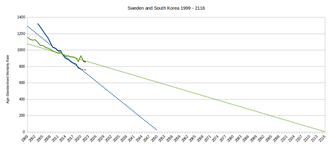
- The trend line calculated for every country included in the analysis shows a decrease in mortality over time. Although each trend is shown as a straight line they surely cannot continue indefinitely - that would mean reaching an ASMR of zero, no deaths at all, at some point in the (not very distant) future. Surely mortality rates must level out at some point? Have some countries reached that point? What about deaths due to Accident, Suicide, Homicide - are we going to prevent those, or change the way they're counted? The trend for South Korea points to acheiving zero deaths in 2050 - just 27.5 years in the future at the time of writing. Sweden's ASMR trend points to zero in 2116 - does that mean they're doing less well than South Korea, or that South Korea is closer to the point where ASMR will have to level off, or that they don't measure deaths or population in the sme way?
A table showing each country's
- Country code
- Country name
- percentage variation in total ASMR over the period 2019 to mid-2022 above or below the expected total predicted by the trend 2009 to 2018
- the above values ranked in order (1 = greatest increase = bad)
- the year in which each country's ASMR trend would reach zero if it continued indefinitely
- the most recent year in which the ASMR was worse than the worst annual ASMR from 2019 to mid-2022
- the reported rate of Covid deaths per million of population (from worldometers)
- the above values ranked in order (1 = highest reported rate = bad)
- the average lockdown stringency score for 2020
- the above values ranked in order (1 = most restrictive)
- the average lockdown stringency score for 2021
- the above values ranked in order (1 = most restrictive)
- the average lockdown stringency score for 2022 so far
- the above values ranked in order (1 = most restrictive)
Country
Code | Country | % ASMR
Variation | Rank/34 | Zero
ASMR
Year | Worst
Since | Reported
Covid
Deaths/million | Rank/34 | Stringency
Score
2020 | Rank/34 | Stringency
Score
2021 | Rank/34 | Stringency
Score
2022 | Rank/34 |
|---|
AUS | Australia | -6.57% | 34 | 2096 | 2019 | 484 | 33 | 55.85 | 6 | 61.12 | 8 | 49.67 | 11 |
AUT | Austria | 5.39% | 19 | 2123 | 2009 | 2,110 | 19 | 47.07 | 19 | 65.35 | 6 | 62.53 | 6 |
BEL | Belgium | 9.47% | 4 | 2087 | 2010 | 2,764 | 14 | 51.22 | 12 | 52.85 | 16 | 47.22 | 16 |
BGR | Bulgaria | 13.90% | 1 | 2124 | 1997 | 5,479 | 1 | 40.35 | 29 | 47.57 | 26 | 47.75 | 15 |
CAN | Canada | 4.03% | 22 | 2123 | 2010 | 1,116 | 27 | 55.00 | 7 | 71.24 | 3 | 77.10 | 1 |
CHE | Switzerland | 7.21% | 15 | 2085 | 2011 | 1,604 | 24 | 42.29 | 26 | 51.09 | 19 | 56.48 | 8 |
CHL | Chile | 3.38% | 26 | 2095 | 2012 | 3,075 | 11 | 62.67 | 2 | 66.43 | 5 | 32.93 | 31 |
CZE | Czechia | 8.78% | 8 | 2079 | 2008 | 3,777 | 4 | 44.78 | 22 | 50.28 | 20 | 36.59 | 28 |
DEU | Germany | 3.99% | 23 | 2134 | 2010 | 1,724 | 22 | 51.81 | 11 | 68.66 | 4 | 68.06 | 5 |
DNK | Denmark | 4.49% | 21 | 2070 | 2016 | 1,161 | 26 | 45.65 | 20 | 48.61 | 23 | 29.21 | 33 |
ESP | Spain | 9.40% | 5 | 2092 | 2009 | 2,379 | 17 | 56.27 | 4 | 55.75 | 13 | 45.46 | 18 |
EST | Estonia | 9.27% | 6 | 2058 | 2010 | 1,983 | 20 | 36.38 | 33 | 38.75 | 33 | 36.06 | 29 |
FIN | Finland | 2.60% | 27 | 2087 | 2018 | 945 | 28 | 38.87 | 31 | 43.41 | 30 | 38.65 | 25 |
FRA | France | 5.07% | 20 | 2109 | 2010 | 2,332 | 18 | 54.29 | 9 | 62.97 | 7 | 69.23 | 4 |
GBR | UK | 7.13% | 16 | 2179 | 2008 | 2,711 | 15 | 56.91 | 3 | 58.61 | 11 | 42.69 | 21 |
GRC | Greece | 3.80% | 24 | 2099 | 2010 | 3,075 | 11 | 54.51 | 8 | 74.89 | 1 | 76.18 | 2 |
HRV | Croatia | 8.03% | 11 | 2084 | 2009 | 4,059 | 3 | 43.31 | 23 | 42.89 | 31 | 40.67 | 22 |
HUN | Hungary | 8.38% | 9 | 2093 | 2007 | 4,888 | 2 | 48.48 | 17 | 48.05 | 24 | 44.23 | 19 |
ISL | Iceland | -2.66% | 32 | 2141 | 2016 | 517 | 30 | 39.40 | 30 | 37.80 | 34 | 37.54 | 26 |
ITA | Italy | 5.70% | 18 | 2105 | 2009 | 2,880 | 13 | 64.67 | 1 | 71.86 | 2 | 75.37 | 3 |
KOR | South Korea | 0.97% | 28 | 2051 | 2019 | 495 | 31 | 49.43 | 14 | 51.42 | 18 | 46.83 | 17 |
LTU | Lithuania | 9.06% | 7 | 2076 | 2009 | 3,492 | 6 | 42.09 | 27 | 46.77 | 27 | 39.60 | 23 |
LUX | Luxembourg | 7.44% | 14 | 2075 | 2013 | 1,721 | 23 | 42.73 | 24 | 46.19 | 28 | 48.79 | 12 |
LVA | Latvia | 6.62% | 17 | 2078 | 2007 | 3,207 | 8 | 42.54 | 25 | 49.96 | 22 | 36.61 | 27 |
NLD | Netherlands | 3.75% | 25 | 2142 | 2009 | 1,309 | 25 | 49.23 | 15 | 59.06 | 10 | 56.48 | 9 |
NOR | Norway | 0.36% | 29 | 2080 | 2019 | 696 | 29 | 41.73 | 28 | 50.25 | 21 | 34.60 | 30 |
NZL | New Zealand | -1.22% | 31 | 2114 | 2017 | 489 | 32 | 36.52 | 32 | 45.10 | 29 | 52.80 | 10 |
POL | Poland | 12.95% | 2 | 2077 | 2005 | 3,091 | 10 | 47.68 | 18 | 54.20 | 14 | 43.82 | 20 |
PRT | Portugal | 8.33% | 10 | 2090 | 2012 | 2,439 | 16 | 54.25 | 10 | 61.07 | 9 | 31.80 | 32 |
SVK | Slovakia | 7.85% | 12 | 2067 | 2007 | 3,710 | 5 | 45.51 | 21 | 53.74 | 15 | 47.92 | 14 |
SVN | Slovenia | 7.76% | 13 | 2071 | 2012 | 3,240 | 7 | 50.02 | 13 | 51.50 | 17 | 56.84 | 7 |
SWE | Sweden | -0.13% | 30 | 2116 | 2013 | 1,896 | 21 | 49.01 | 16 | 47.99 | 25 | 38.96 | 24 |
TWN | Taiwan | -3.03% | 33 | 2098 | 2019 | 389 | 34 | 24.03 | 34 | 40.87 | 32 | 16.95 | 34 |
USA | USA | 11.07% | 3 | 2341 | 2003 | 3,138 | 9 | 56.16 | 5 | 56.94 | 12 | 48.43 | 13 |
According to the calculated trends all but two countries (UK and USA) will acheive zero deaths in the century between the years 2050 and 2150. Clearly this should be impossible - and certainly not a Good Thing™ (if you don't think so, you have not read enough dystopian science fiction). One interpretation of this is that we should expect the death rate curves to flatten out and that perhaps the USA and UK have already almost reached their lowest practical ASMR (based on the current way they measure mortality).

If you wish to comment you may email me at: SoundOfReason0 at gmail dot com. If I append your comment I will not publish your email address.