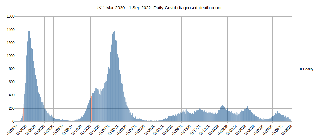
The chart of deaths attributed to Covid-19 is derived from ONS weekly deaths data up to week 37 of 2022 published 27 Sep 2022.
We have seen elsewhere the huge spikes in deaths in April 2020 and December 2020/January 2021 conform to natural epidemic (Gompertz) curves, and that the lockdown interventions on 23 Mar 2020, 5 Nov 2020 and 6 Jan 2021 (highlighted in red) did not cause the peaks and subsequent declines in the epidemic curves or any significant deviation in the curves. But what about the smaller peaks in later 2021 and into 2022? Could these just be mini epidemics?
There are a total of eight peaks (including the first peak in April 2020). If we attempt to fit the overall cumulative death data to eight Gompertz curves we find the following:
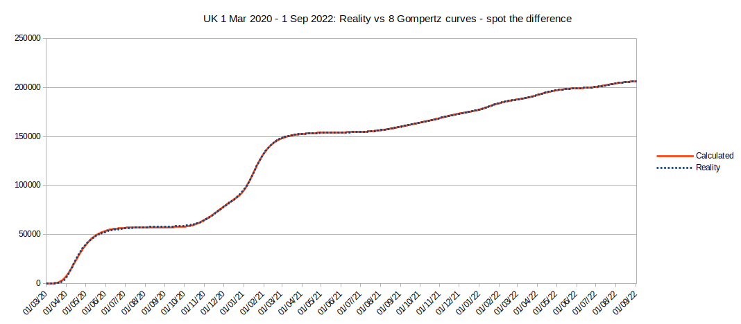
Honest - that's the Cumulative Covid deaths for the UK (dotted blue line) as in tab 9 of the above spreadsheet overlying the best-fit total calculated using eight Gompertz curves (the solid red curve). I've used a dotted blue line because otherwise we can't see the red - the match is that close.
Yes, it's Gompertz all the way down.
Here's the non-cumulative (daily) version with reality superimposed.

The second (yellow) and third (green) peaks correspond to the reports of the Alpha and Delta variants of the bug. The sixth (dark green) corresponds to reports of the Omicron variant. After Omicron failed to kill as many as the first three variants of the bug the media seemed to lose interest in death count and focussed on 'cases' instead.
In the cumulative view the eight cuves have these formulae:
<Deaths_1> = 5.748E+04 * EXP(-1.201E+01 * EXP(-5.557E-02 * <Dayno>)) +
<Deaths_2> = 4.962E+04 * EXP(-1.547E+03 * EXP(-2.715E-02 * <Dayno>)) +
<Deaths_3> = 4.757E+04 * EXP(-9.901E+08 * EXP(-6.422E-02 * <Dayno>)) +
<Deaths_4> = 1.912E+04 * EXP(-7.295E+04 * EXP(-1.995E-02 * <Dayno>)) +
<Deaths_5> = 5.247E+03 * EXP(-9.640E+10 * EXP(-4.058E-02 * <Dayno>)) +
<Deaths_6> = 1.111E+04 * EXP(-3.466E+13 * EXP(-4.520E-02 * <Dayno>)) +
<Deaths_7> = 1.008E+04 * EXP(-1.378E+15 * EXP(-4.554E-02 * <Dayno>)) +
<Deaths_8> = 7.120E+03 * EXP(-2.076E+17 * EXP(-4.585E-02 * <Dayno>))
Where <Dayno> = 1 is 1 Mar 2020
But... so what? I've shown it was a series of natural epidemics totalling over 200,000 deaths for the UK. Now what?
The point is that we should now expect that if we get another 'wave' it will follow a natural epidemic curve whether or not we lock down. This is very useful for planning - if it looks like another wave has started and the toll is beginning to rise less steeply then we can be confident that it is flattening out and we can predict its toll quite accurately - and prepare accordingly. In fact we should have expected the course of the first epidemic to follow a Gompertz curve; it's a natural epidemic curve and we knew that the 2014/15 'flu looked like that too. If our expert government advisers had assumed 'Gompertz' at the beginning then they would have realised that the peak of infections of the first wave was already past and not advised the first lockdown. After the first wave so clearly followed Gompertz, why did government and their advisers not assume Alpha and Delta would too and not repeat the failed lockdown policy (twice more)?
It is also clearly the case that these epidemics do not have a strong seasonal variation (they don't get bad exclusively in Winter), so dire warnings about collapse of the health service in Winter need to be considered carefully and perhaps weighed against similar warnings dating back 40 years (and probably more).
It is notable that the 'Alpha' curve is lower and wider than the 'Delta' curve even though Alpha apparently killed more people (49,620) than Delta (47,570). Alpha reached a peak of 496 deaths per day on 26 Nov 2020 and Delta reached a peak of 1,124 deaths per day on 17 Jan 2021 (though on that day Alpha was still going and also killed 257 people; 1,381 deaths total on that day). The fourth wave starting in July 2021 is also low and wide: it caused 19,120 deaths with a peak of 140 deaths per day around 13 Sep 2021. Presumably the different variants have different characteristics resulting in different spread and mortality rates.
A peculiarity of the epidemics from mid 2021 onwards is that they fizzle out with relatively low death tolls as compared with the first three waves. Is this because of the vaccines? Herd immunity? Or perhaps because we had fewer extremely vulnerable people? As always, further research is needed.
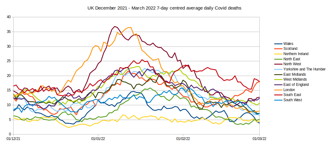
If we examine the data from December 2021 to March 2022 (Omicron) we can see that the epidemic(s) during this time affected different regions of the UK to different extents. London and the North West region of England were worst affected followed by the South East of England and Scotland. Were these areas all affected by Omicron or were they different variants in the Northern part of the islands compared with the South? Omicron seems to have missed Northern Ireland completely.
Our government steered the lockdown measures through Parliament in just one week (First Reading: 19 March 2020, Royal Assent: 25 March 2020). Both Houses of Parliament passed the measures without division and the Scottish Parliament gave immediate Consent and passed their own supplementary law in one day without dissent. Even so some members of the opposition parties and trade unions called for even quicker and tougher restrictions. It will be difficult for our political classes to admit that lockdown was a mistake; even if they did so, they would face enormous denial from the politicians in other countries (most especially those who locked down even harder than the UK). Eventually the truth will out.