2020 UK deaths in historical perspective [PDF]
Most of the above chart is generated from data in ONS' Monthly mortality analysis, England and Wales: Dec 2022 (https://www.ons.gov.uk/peoplepopulationandcommunity/birthsdeathsandmarriages/deaths/datasets/monthlymortalityanalysisenglandandwales), Table 10. (Downloaded 20 Jan 2023). In addition I have included data from this 'Freedom of Information' (FoI) report.
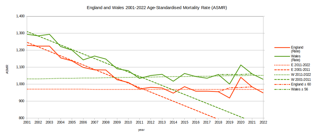
Interpretation notes:
- Non-zero 'Y' axis.
- The data is age-standardised all-cause deaths per 100,000 people (Age-Standardised Mortality Rate; ASMR) for January to December for England and Wales (separately) in the years 2001-2022.
- Jan-Dec 2001 compared with Jan-Dec 2002, Jan-Dec 2003 and so on up to Jan-Dec 2022.
- ASMR is expressed in deaths per 100,000 people per year. An ASMR of 1,000 represents 1% of the population.
- ASMR is a standard way of expressing death rates as a single figure for a whole population which is comparable between years and countries (ie it takes into account population changes such as the baby boom ('boomer') cohort - the first of whom should turn 75 in 2022).
- Wales' ASMR seems consistently about 50-80 higher than England's (eg in 2011 England 972.6, Wales 1,034.4 deaths per 100,000 population).
- Where's the data for the rest of the UK? ONS mostly provides data for England and Wales only; Scotland and Northern Ireland have separate agencies and produce independent reports.
- The red, solid line shows the ASMR in England as calculated by ONS in the monthly report.
- The green, solid line shows the ASMR in Wales as calculated by ONS in the monthly report.
- The yellow line shows the ASMR in England and Wales (combined) as calculated by ONS in the FoI report mentioned above.
- The yellow (England and Wales combined) line is a very close match for the red (England only) line. This is because the population of Wales is so much smaller than England's and does not influence the combined figure as much as one might otherwise expect.
- The red 'dot-dash' line shows the 'counterfactual' (ie 'what if', otherwise known as 'completely made up') adjusted figures for England for 2019 and 2020. The 2019 ASMR figure was arbitrarily increased by 60 and the 2020 figure decreased by the same amount. It is up to you to decide whether you think the adjustments suggest anything interesting.
- With a population of about 56.8 million people in England, 60 per 100,000 currently represents about 34,000 people's deaths. The swing from -60 (below baseline in 2019) to +60 (above baseline in 2020) deaths per 100,000 represents a year change of 68,000 people's deaths (the UK Government COVID-19 dashboard gives the 2020 death toll as 66,634 in England).
- The 2019 dip for Wales was even more pronounced than that for England.
- We can see a similar but less extreme dip and spike in 2014/15 - an adjustment of ±35 for England in those years would even out the curve.
- 2020 was certainly an unusual year, but so was 2019. Other ONS published statistics for 2021 recognise that 2020 was unusual and so base their common 5-year historical comparisons on the 2015-2019 average rather than the most recent 5-year period (ie they include the unusually low year of 2019 but not the unusually high year of 2020). Using an average that includes 2019 tends to make 2020 and 2021 look worse than when viewed from the perspective of two or more decades. I think a more sensible 5-year average would be 2014-2018 which would avoid the 2019 dip and include both the 2014 dip and the 2015 spike. Better yet would be to use a ten year average.
- Prior to 2009, ASMR was regularly above the levels reached in 2020 for both England and Wales.
- You will notice that the years 2001-2011 show trends of decrease in ASMR which seem to level off after 2011. If those trends did continue we would reach zero deaths in England by the year 2047 and in Wales by 2050 - clearly a ridiculous extrapolation.
- Some may hold the opinion that the 2020 peak in mortality would have been higher if the countries of the UK had not undertaken lockdowns. However, in other analysis I have shown that lockdowns have not been effective in England and Wales.
The ONS monthly mortality analysis with ready calculated ASMR up to the most recent month for England and Wales only goes back to the year 2001. If we want to examine the longer-term trend we have to calculate the ASMR ourselves. Fortunately, we can get annual death and population figures in standard age groups for the whole of the UK from The Human Mortality Database (HMD, https://mortality.org) covering 1922-2018 (ie since the partition of the island of Ireland). By standardising these to the European Standard Population 2013 we can derive the ASMRs for the whole UK for this period.
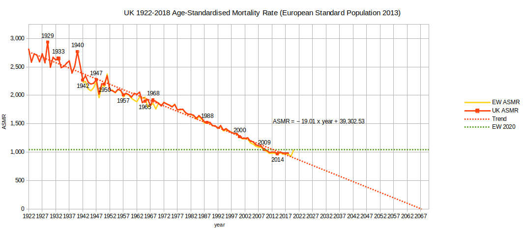
- Dates of possible interest
- 1929 - Start of the Great Depression
- 1933 - Publication of the discovery of Influenza virus
- 1940 - Start of WWII hostilities in UK, the Blitz
- 1942 - Diphtheria vaccinations
- 1947 - Inception of the NHS
- 1950 - Introduction of BCG vaccination and publication of link between smoking and cancer
- 1957/8 - 'Asian flu' epidemic
- 1965 - Cigarette advertising banned on UK TV
- 1968/9 - 'Hong Kong flu' epidemic
- 1988 - Introduction of MMR vaccination (see also: NHS vaccinations and when to have them)
- 2000 - Annual influenza vaccination offered to over 65s (now also under 10s)
- 2009/10 - H1N1 (swine) flu pandemic
- 2014/5 - H3N2 flu - ineffective vaccine
- 2020/1 - Coronavirus pandemic, CoViD-19
- 2021 - Coronavirus vaccination introduced
- The red, solid line is the (whole) UK Age-Standardised Mortality Rate calculated from the data concerning deaths and populations downloaded from the Human Mortality Database (HMD) combined with the European Standard Population.
- The yellow line is the England and Wales (only) Age-Standardised Mortality Rate calculated by ONS in the FoI report mentioned above. The closeness of the match with the UK (red, solid) line shows that including the Scotland and Northern Ireland figures with the England and Wales (only) figures does not greatly change the shape of the graph.
- The red, dotted line is a best fit linear regression line through the UK ASMR data for 1922-2018. Extrapolating the regression line shows the ASMR trending towards zero in 2067 (less than 50 years away).
- The green, dotted line is the England and Wales (only) ASMR for the year 2020 as calculated by ONS in the above report.
- The leveling off of the decline in death rate from around 2011 as seen in the monthly chart at the top of this page is apparent in the above long-term chart.
- According to these figures, if the long-term trend in UK mortality continued indefintely we would abolish death in the whole UK by 2068 - a Science Fiction nightmare.
- Has mortality actually stabilised at about 1,000? If not, when and at what level should we expect it to stabilise? Should we expect it to stabilise? Should public policy change to cope with this trend, and if so, how? Has it already changed?
- Can mortality continue to decline until the only deaths are Accident, Homicide and Suicide? From other ONS data sources (NomisWeb): Accident, Homicide & Suicide account for around 35.5 deaths per 100,000 people per year (age-standardised) in England and Wales (2013-2020 data).
- The peak in ASMR for England and Wales (only) in 2020 was 1,043.5 deaths per 100,000 people per year. It seems reasonable that the (whole) UK figure will be roughly similar (but it may be slightly increased if Scotland and Northern Ireland have higher figures). Prior to 2010 the UK had never seen an ASMR as low as this (note that this is comparing England and Wales figures with whole UK figures).
- Why do I (and ONS) calculate the age-standardised mortality rate rather than the simpler 'deaths per 100,000 people'? Surely the population doesn't change so much that it makes a significant difference from year to year?
- Since 1981 more than half the deaths each year are among people over 75. 1937-1980 it was over 65s and prior to that it was over 45s.
- In the decade 2010-19 the over 85s increased from 2.1% of the UK population to 2.4%.
- In the same period the 75-84s increased from 5.6% to 6.0%.
- In the same period the 65-74s increased from 8.6% to 10.0%. Note that the first of the post-war Baby Boom ('Boomers') cohort had their 65th birthdays in 2012.
- In 2022 the first of the Boomers will 'graduate' from the 65-74 into the 75-84 age group.
- Yes, the population is significantly changing/aging; remember the majority of deaths are currently among the over 75s. How long before most of the deaths each year are among over 85s?
It would be strange if the age at which people typically die remained the same but the rate of deaths declined. The fall in mortality rate is, of course, reflected in the rising age at which people typically die.
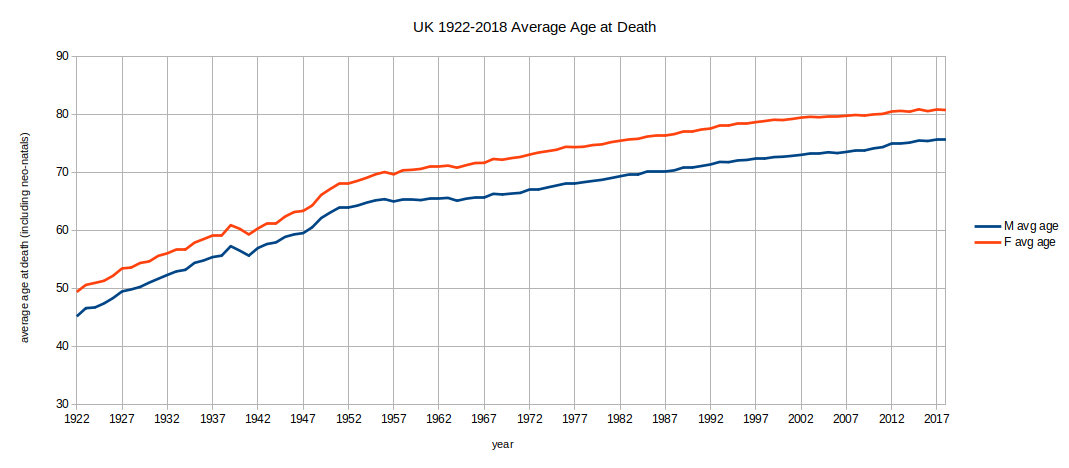
- Males die a bit younger than females. We don't really know why, but we know it's not a recent phenomenon.
- Note that the average age at death is levelling off at around 80 for females and 76 for males.
- Average age at death is not the same as life expectancy. Bear in mind the nature of averages: If you're aged 75 your life expectancy is not 1 year if you're male or 5 years if you're female, it's more. You've already avoided the risk of dying as an infant or reckless young person.
- The fact that in recent years people on average die at a greater age than people did a few decades ago means that the proportion of more elderly people in the population has increased. The ratio between working-age and retirement-age people has shifted. This effect has an impact on health and care requirements and provision.
- Given the difference in average age at death, should men and women be treated differently by welfare policy?
We can look at age at death another way. What is the life expectancy of a child born in a particular year?
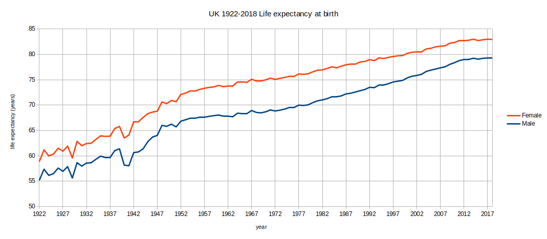
- The above chart is from life expectancy data calculated by and downloaded from the Human Mortality Database.
- Note that this again shows that males are expected to live shorter lives than females.
- For example a male child born in 1955 was expected to live to an average age of 67 and a female born in 1951 was expected to live to an average age of 71 (ie they were both assigned an average date of death in 2022).
- Again these are averages. If you're healthier than average then you'll probably live longer than most born the same year as you. Of course, if you're less healthy than average then the opposite applies.
- Most people who have survived their reckless young years will exceed their life expectancy at birth.
- The improvement in life expectancy appears to be levelling off in the last decade or so at around 79 for males and 83 for females.
You may wonder whether the observed long-term trend in mortality is unique to the countries of the UK. Wonder no more.
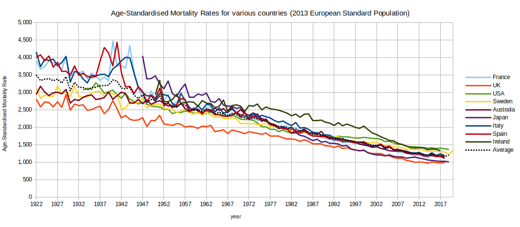
- Of the listed countries/federations/kingdoms Sweden's data is most up to date; it has already submitted data for 2020 into the Human Mortality Database.
- Note the dip and spike for 2019/2020 showing in Sweden's graph - similar to that shown in England's and Wales' monthly graphs at the top of the page.
- Most countries have so far only submitted data up to 2018 or 2019. When more up-to-date data is available, will we see a dip and spike effect for all countries badly affected by the Covid-19 pandemic?
- Not all countries have submitted data from 1922 onwards:
- USA's data starts in 1933.
- Japan's data starts in 1947.
- Ireland's data starts in 1950. It consistently has one of the highest ASMRs of the nine countries.
- Sweden's data is available going back to 1751, France from 1861, Italy from 1872, Spain from 1908 and Australia from 1921. I have not included this earlier data on the chart as I'm most interested in comparisons with the UK - that's where I live.
- A notable omission from the chart is Germany; their data only starts in 1990 (ie after re-unification).
- The impact of WWII is most clearly seen for those countries which suffered occupation.
- Some of the impact of WWII on mortality is exaggerated by territorial changes - the re-drawing of borders.
- The UK's ASMR is consistently among the lowest of the listed countries.
- Having started high soon after the end of WWII, Japan's mortality rate is now very similar to the UK's.
- The mortality rates for all countries have tended downwards and seem to be levelling off at around 1,000-1,400 deaths per 100,000 people in the early 21st century (ie about 1.0%-1.4% of the population). Is this the lower limit for mortality?
- There are many other countries which have submitted their mortality data into the Human Mortality Database. If you are interested you can download them; free registration is required. I've used the 5x1 deaths tables (deaths among 5-year age groups for each year) and 5-year population tables (population in 5-year age groups for each year). There are many more countries which do not make their data available or cannot provide adequate quality data.
- I have selected the nine countries above on a whim. I've mostly included countries from Europe but also from the Far East, southern hemisphere and the USA. I have not examined data from other countries which I have not then included in this analysis. In other words, I have not deliberately selected data to emphasise a point (I only looked at Germany's data long enough to discover the start-date, I decided not to include it as it didn't go back far enough. I didn't analyse it further).
The above chart is rather cluttered; it's difficult to clearly see what's happening to the trend. If we just look at the average of the ASMRs from all nine countries we see the following:
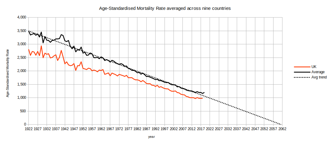
- Just for comparison I have also included the UK ASMR on the above chart. As I mentioned above: I live there.
- In the most recent decade UK ASMR is about 210-230 below the average of the nine countries.
- Yes, the average ASMR across nine countries seems to be levelling off at about 1,200 in the early 21st century.
- The long-term trend for the UK is broadly similar to, but among the lowest of the nine countries.
I was looking for a snappy tag-line to describe 2020. Unfortunately, 'The Great Panic' has been used too many times in the past. The best I could come up with was:
2020: The highest annual mortality rate in twelve years.
Although the annual mortality rate for 2020 only reached a 12-year high, most of the extra deaths occurred in a few short periods of time rather than spread throughout the Winter months. It's not too surprising that people found this frightening and worried that the health service would be overwhelmed. Media reports using the term 'exponential' (ie increasing faster and faster without limit) and referring to the 'R Number' or 'doubling every x days' (which are both round-about ways of saying 'exponential') didn't help. Diseases only spread exponentially in Science Fiction; in the real world epidemics follow a Gompertz mathematical function which is essentially two mutually counteracting exponential functions and which is ultimately self-limiting.
The fact that epidemics follow Gompertz functions is somewhat supported by epidemiologists grand modelling theories but was actually just born out of observation. We don't really need to know why, but that they do follow these functions.
We also heard that Sweden (which did not do 'lockdown' like most other countries) fared worse than other Scandanavian countries. For them 2020 was the highest ASMR since... 2013. So, highest mortality in seven years.
The thing we also ought to say is:
2019: The lowest EW annual mortality rate in over 97 years (and probably the lowest ever).
For Sweden 2019 was the lowest ASMR ever.
The peak in 2020 for UK and Sweden was at least partly due to so many frail people not dying in 2019.
Will we learn lessons from this and prepare better when we next have a year with unusually low mortality? Probably not.
An alternative view of age-standardised mortality
One thing that occurred to me as I was researching this post is that it's rather peculiar to measure mortality from 1 Jan to 31 Dec. I know we want a fixed time period for comparisons (one year is usual) but why place the start and end point right in the middle of the usual peak death and public holiday period for the northern hemisphere? Winter months usually bring increased mortality compared with summer months and public holidays can delay death registrations. Also a calendar year is 365 or 366 days. Added to this if we use weekly mortality reports in order to get the most fine-grained information, most years have 52 weeks but some (2009, 2015, 2020) have 53 weeks.
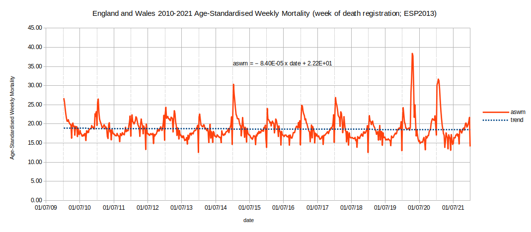
- Why not calculate ASMR based on a mid-year cutoff (ie 1 Jul to 30 Jun, or '52 weeks ending at ISO Week 26') as indicated by the mid-year major grid lines in the chart above?
- The minor (dotted) grid lines in the chart above show that we usually get a dip just before New Year followed by a spike directly after. These dips and spikes are not significant variations in the death rates, they are delays in death registration caused by the register offices being closed for the Christmas and New Year public holidays.
Below I show a chart of mid-year annual (actually 52 week) age-standardised mortality for England and Wales based on the weekly death data published by ONS which (only) goes back to Jan 2010.
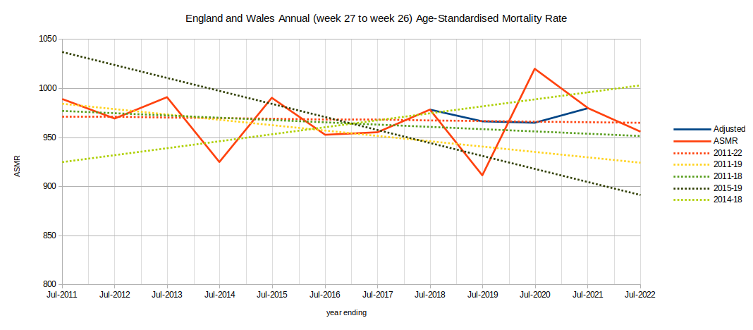
- The solid red line is the calculated ASMR for the 52 weeks ending in ISO week 26 of each year. As the source data starts in Jan 2010 our first mid-year ASMR point is based on data from week 27 of 2010 to week 26 of 2011.
- Using this mid-year approach means that the figures for 2021 include the peaks of both the Alpha and Delta waves of the pandemic in England and Wales. If we used the more conventional 1 Jan cut off, the Alpha peak would be in 2020 (along with the peak caused by the original bug) and the Delta peak in 2021 - and the chart would appear similar to the second half of the chart shown at the top of this page. Similarly the Omicron peak will appear in 2021 or 2022 depending on which approach we use.
- The solid dark blue line is a conterfactual (ie completely made up) line where the 2019 ASMR datapoint has been arbitrarily increased by 55 and the 2020 datapoint decreased by the same amount. It demonstrates that they almost cancel each other out.
- When the figures for a single year are mentioned in the text below they refer to the 52 weeks (364 days, about 1 year) ending in the middle of that year (ie the last half of the preceeding year and first half of the mentioned year; a figure for 2019 covers 52 weeks from 30 Jun 2018 (week 27 2018) to 28 Jun 2019 (week 26 2019)).
- The mid-year approach also means that the calculated figures do not include week 27 of 2015 or 2020 (eg the figure for 2016 is based on week 28 of 2015 to week 26 of 2016; 52 weeks). As week 27 is a particularly low scoring mid-summer week the effect on the overall figure is negligable.
- In addition to the calculated ASMRs I have included various trend lines based on different selections:
- mid-2011-22 (red, dotted) - this trend line uses all 12 of the data points. It is almost level and shows 2020 to be about as far above the trend line as 2019 is below; 2021 is about as high above the trend as 2018 is.
- mid-2011-19 (yellow) - As 2020 is considered to be unusual we'll exclude that data point onwards from our long term trend. This trend uses 9 data points and makes 2020 - 2022 look very bad indeed.
- mid-2011-18 (dark green) - I would argue that if we're going to exclude the unusually high years of 2020 - 2021 we should also exclude the unusually low year of 2019. This trend uses 8 data points and looks fairly similar to the first (all points) trend.
- mid-2015-19 (grey) - Let's go for a 5 year trend ending in 2019. This 5 data point trend is arguably the most extreme. It makes 2011, 2012, 2013 and 2014 look extremely good and 2020 - 2022 look extremely bad. It would be crazy to compare against this trend line; the trend predicts zero deaths by 2090.
- mid-2014-18 (light green) - Following my argument that 2019 was an unusual year too, let's cut it out and use the 5 years before that as our comparison. This 5 data point trend makes 2011, 2012, 2013 and 2015 look very bad and 2020 - 2022 look moderately bad, 2019 looks good.
- Of all the possible trend lines shown, the one where we do not arbitrarily exclude some data just because we don't like the look of it (ie we use all twelve data points) seems the most convincing to me.
- The diversity of the possible trend lines highlights the fact that selecting different datasets for comparison can result in very different conclusions. Cherry-picking the data for comparisons is a statistical sin. We've got twelve years of data, why limit ourselves to 5-year trends?
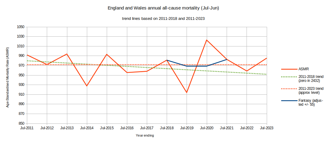
Here's the chart updated with data to mid 2023. The all-data trend still looks right.
Which trend line do you believe?..
...they're all mathematically correct... and why is this question important?
I'd like to draw your attention to the fact that because ONS consider 2020 to be an unusual year they have opted to publish 2021 data compared to a 5 year average ending in 2019 (ie they have used 2015-2019). Using 2015-2019 for our comparisons gave the most crazy extreme results of all in our chart above (note, however, that they're using an average, I'm using a trend). If the 2015-2019 trend continued we would have no deaths at all by December 2090. Using the 2014-2018 trend gave us something nearly as bad but in the opposite direction.
This note is quoted from the ONS weekly mortality report:
This average is based on the actual number of death registrations recorded for each corresponding week in 2015 to 2019. Moveable public holidays, when register offices are closed, affect the number of registrations made in the published weeks and in the corresponding weeks in previous years. The five-year average has been provided for 2015 to 2019 (rather than 2016 to 2020) because of the impact of the coronavirus (COVID-19) pandemic on deaths registered in 2020. The average for 2015 to 2019 provides a comparison of the number of deaths expected per week in a usual (non-pandemic) year. Data by week for 2020 has been provided separately for comparison.
- The total number of deaths in England and Wales to the end of week 26 2022 (mid-2022) where Covid was mentioned on the death certificate is a terrifying toll of 178,244 people.
- Comparing against the eight year trend of mid-2010 to mid-2018 there were 33,063 excess deaths above trend in the four years mid-2018 to mid-2022.
- Many deaths occurred in very short spaces of time in 2020-21 but the overall excess death toll was not as high as headline news would have it. It was lower by a factor of more than 5 below the Covid diagnosed death toll.
- Comparing against the full twelve year trend of mid-2010 to mid-2022, there were 2,687 excess deaths in the four years mid-2018 to mid-2022. Lower by a factor of 66 below the Covid diagnosed death toll.
- This is why justifying our choice of trendline to compare against is so important.

https://soundofreason.co.uk/233f2f57-93e4-44b5-a69d-a48b2b0fbc08/index.html
If you wish to comment you may email me at: SoundOfReason0 at gmail dot com. If I append your comment I will not publish your email address.