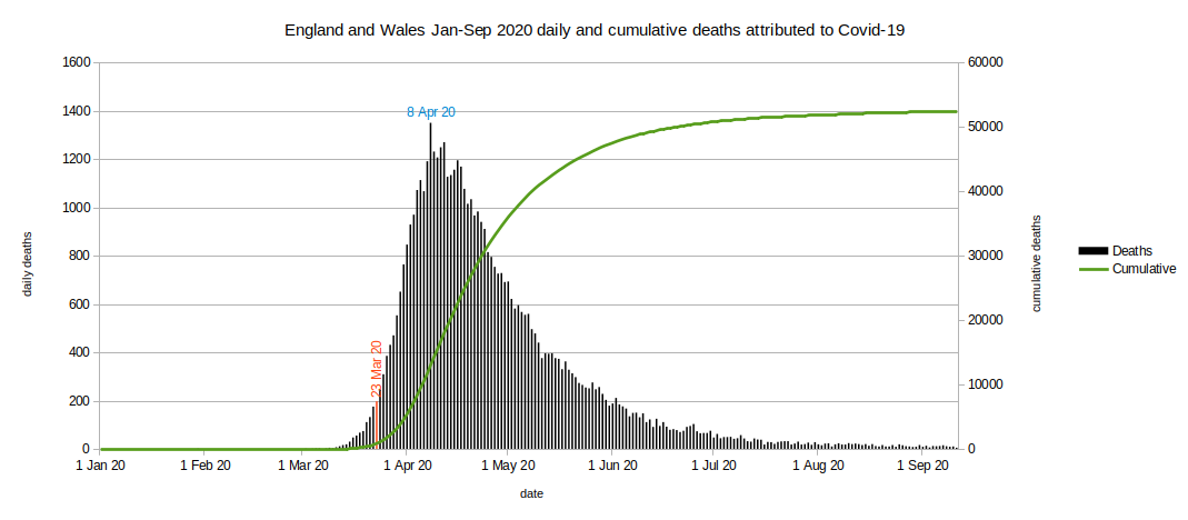
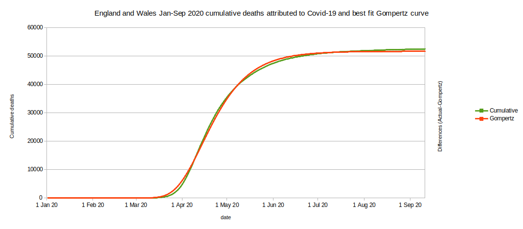
The graph of cumulative deaths (green curve) has a distinctive shape. It looks like a Gompertz curve. We can use a statistics application (R version 3.4.4 (2018-03-15)) to work out which mathematically correct Gompertz curve has the closest match to reality.
The calculated curve has the formula (5.17E+04 * exp(-3.61E+02 * exp(-5.64E-02 * dayno))) where dayno=1 is 1 Jan 2020.
We can plot the (small) differences that there are between reality and the calculated values (blue curve, scale to the right).
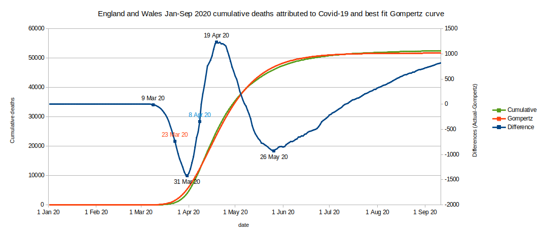
- If the conditions driving the death rate had remained the same throughout, then there would be minimal differences between reality and the calculated curve. Any small differences would vary randomly above and below the calculated value. However, in fact the differences show distinct phases where reality falls behind or runs ahead of the calculated value. Points of interest are when the trends in differences abruptly change direction and what may have caused these changes.
- Essentially, what we have is a natural epidemic curve with a few minor deviations in the trend of deaths at certain times. We need to try to explain the deviations by relating them to events and changes in people's behaviour.
- At around 9 Mar 2020 the number of deaths began to fall behind the calculated number. Deaths were increasing, but not as fast as the calculated curve. At this point reality was apparently better than the calculated number (blue curve is descending).
- Reality continued to give us fewer deaths than the calculated number until at around 31 Mar 2020 the number of deaths began to increase sharply and rapidly overtook the calculated number. We could deduce that something bad happened to cause infections to begin rising more rapidly 16 days prior to 31 Mar 2020 (ie at around 15 Mar 2020, if lockdown worked). However, I am not aware of any policy change at around that time.
- At around 19 Apr 2020 the rate of deaths began to slow relative to the calculated curve (a good thing). To cause this to happen the rate of infections should have begun to decline 16 days previously ie at around 3 Apr 2020 (if lockdown worked). Again, no obvious policy changes occurred at that time.
- There is no inflection in the differences curve at 8 Apr 2020 (the date of peak death rate and 16 days after the lockdown). In other words the lead-up to the peak of deaths and the following decline show no deviation relative to a natural epidemic (Gompertz) curve (between 31 Mar 2020 and 19 Apr 2020).
- In examining whether the 16-day lag between infection and death is real, we can see that there is no deviation from an epidemic process in the infection rate between 15 Mar and 3 Apr 2020.
From the above I conclude that the first lockdown did not work as intended. The lockdown did not cause an immediate or proximate decline in infection rate leading to the decline in deaths 16 days later. The proposed 16-day lag between lockdown and peak deaths is not apparent in the data.
Lockdown did not have a massive effect on the infection rate and so was not effective in causing the death rate or disease rate to begin to decline from 8 Apr 2020 or therefore to protect the NHS from being overwhelmed.
We should now explore the possibility that lockdown had a more subtle effect:
- We can observe a deviation from the natural epidemic curve at 31 Mar 2020. I do not think lockdown can be responsible - I have not thought of a mechanism that could relate the two events.
- The deviation at 31 Mar 2020 is only 8 days after the lockdown was announced, though, to be fair, lockdown was clearly being anticipated and talked about from at least 16 Mar 2020.
- I sincerely hope that lockdown is not responsible for the deviation at 31 Mar 2020; it's a deterioration and not an improvement. I think the most likely explanation is a change in the willingness of doctors to certify deaths as Covid-19 - but I have no hard evidence for this.
- The Coronavirus Act 2020 which became law on 25 Mar 2020 contains provisions for changes to death registration practices during the emergency; if implemented, these might have an almost immediate effect to increase the count of deaths attributed to Covid-19.
- The next deviation from a natural epidemic curve is at around 19 Apr 2020 - eleven days after the peak of deaths. Rather than a sharp change it seems to take several days to reach its full effect. If that is the effect of lockdown then it has taken around 27 days to manifest (to aid visualisation on the chart consider that to be about a month). Perhaps this is the effect of more robust victims succumbing slightly later then others.
- If lockdown took 27 days to have an effect, then the average period from infection to death must also be 27 days.
- Therefore the peak of infections must have occurred 27 days before the peak of deaths (on 8 Apr 2020), ie at around 12 Mar 2020.
- If infections began to rise less rapidly or fall from 12 Mar 2020 then lockdown on 23 Mar 2020 was not required to suppress the infection (or relieve pressure on the NHS).
- On 12 Mar 2020 the UK government did announce a change of strategy: a change from 'contain' to 'delay'. I don't see how this could possibly have led to infections beginning to rise less rapidly.
- On 12 Mar 2020 BBC News broadcast a special report entitled 'Coronavirus: Your Questions Answered'. Maybe this and similar media reports caused people's behaviour to change? Again, there's no hard evidence for this.
- By 12 Mar 2020 there had been 35 deaths in England and Wales formally attributed to Covid-19 (mentioned on the death certificate) though only 3 had actually been registered by that date.
- These academic papers from 2007 and 2015 show that people modify their behaviour in the face of a deadly epidemic.
- There is a gradual upward deviation in death rates at around 26 May 2020. This suggests an increase in infection rates from around 30 April, if the 27-day 'lag' is real. I am not aware of any policy change at around that time. It may be 'behavioural fatigue', 5-6 weeks after lockdown - if indeed lockdown had any positive effect (see https://www.bmj.com/content/370/bmj.m3166).
- There is no significant change associated with the gradual easing of government restrictions during Jun-Jul 2020 (non-essential shops reopened and masks became mandatory on public transport on 15 Jul 2020). If the 27-day 'lag' applies then we should expect to see changes in the differences during Jul-Aug 2020. However, we don't; it may be difficult to see the difference between 'next-to-nothing' and 'next-to-nothing plus a bit more'. 97% of the deaths attributed to the first epidemic had occurred before the end of June 2020.
The first lockdown in England and Wales did not work.
- This sort of analysis is retrospective. The approach is not useful for predictions. In particular, a Gompertz analysis before the peak death rate in early April 2020 (by which time there had been about 15,000 deaths; about 30% of the total for the initial epidemic) would have given misleading results.
- The analysis is based on information put on death certificates by medical practitioners.
- The data is accepted as provided*; there is no attempt to compare the death count with other sources (such as those provided on the Government dashboard).
- The selected data contains no information to distinguish between death with Coronavirus or from Covid-19.
- There is no comparison with previous years' non-Covid-19 death data or any estimate of 'excess' deaths.
- There is no analysis of age or sex distribution among the deaths attributed to Covid-19.
- There is no comparison with other countries' policies or reported numbers.
- The data contains no information on 'Long Covid' for comparison with other diseases and sequelae.
- The analysis also does not address a number of controversial issues:
- Whether an earlier lockdown might have been effective and, if so, when would be optimum.
- What population behaviour change was most beneficial and whether media coverage (mainstream or 'social') helped or hindered that change.
- If mask-wearing laws had any effect on mask-wearing or social contact behaviour and whether that had any impact on sickness and death rates.
- Whether border controls had any effect on the course of the epidemic and whether different controls would have resulted in a better or worse outcome.
- Any analysis which attempts to address any of these issues must be robust - an appeal to 'common sense' is futile. It must 'stand to reason' in the literal meaning of the term. Common sense is not common and too often it is not sensible.
Key points:
- The Covid death data covering the period 1 Mar 2020 - 31 Aug 2020 published by ONS is a very good fit for a natural epidemic (Gompertz) curve.
- The data shows very minor deviations from the best fit mathematically 'correct' Gompertz curve. These deviations might be the effect of the lockdown and other interventions.
- If the deviations are the result of the lockdown or other policies then they are disappointingly small effects.
- If the deviations are not the result of the lockdown or other policies then those policies had no observable effect at all.
Check out the next post for an analysis of the second and third lockdowns in England and Wales.
I realise that almost all of the above is about England and Wales but here is a quote from Scottish Health Secretary Humza Yousaf (BBC article from 19 Jun 2022):
We are seeing higher numbers of infections across our communities at the moment which is why booster vaccination is needed to maintain the best protection for those at highest risk of severe effects from the virus.
Vaccination has been our most effective tool against coronavirus. However, the degree of protection offered wanes over time.
Almost 90% of over-75s and around two thirds of those who are immunosuppressed have already taken a spring booster.
We continue to encourage everyone to receive the doses they are eligible for as and when they become available.
Did you spot the point that "Vaccination has been our most effective tool against coronavirus"? So, the most effective tool has not been lockdown - at least, not in Scotland.
If you wish to comment you may email me at: SoundOfReason0 at gmail dot com. If I append your comment I will not publish your email address.
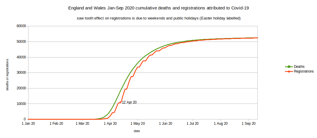
- The above spreadsheet* contains many other tabs but most of them provide death data based on date of registration, not date of death - and summarized by week, not by day.
- Fortunately there's a tab labelled 'Covid-19 - Daily registrations' which helps us to understand the typical delay between date of death and date of registration (4.2 days average in April 2020)
- Within that spreadsheet tab I have selected the column headed 'England and Wales'
- The cumulative death registrations data is simply a running total of the daily registrations
- Note the effects of weekends and public holidays on registration delays. The Easter holiday (Fri-Mon inclusive) is highlighted.
- Most other data in the spreadsheet is presented as death registration totals up to the end of each Friday. As death registrations occur throughout each weekday the weekly totals should be considered to be centered about 3.5 days prior to the end of the week. When looking at this weekly registration data it is reasonable to assume that, on average, death occurred 7-8 days (4.2 days plus 3.5 days) before the last day of the week in which it was registered.
*There are inconsistencies in the data entry for the above spreadsheet. Sometimes dates have been entered as date values and sometimes as text. The data were transcribed to correct this.