Excess deaths and Covid-19
In a previous post I've demonstrated that, based on the numbers of deaths registered in England and Wales where Covid is mentioned on the death certificate, lockdown did not work as a method of curtailing the spread of the Coronavirus.
Some have claimed that a significant proportion of the above death registrations represent people who have died with Covid-19 rather that of the disease; in other words they claim these people would have died soon of other conditions.
To examine this idea we can compare the numbers of deaths against the normal or expected number of deaths and examine what differences there are.
A simple comparison of death numbers without correcting for population changes could be misleading; we need to work out the death rates among the different sex and age groups of the population and compare those.
- We can get death registration data for England and Wales published weekly by ONS. Data for 2010 to 2019 was published using seven age groups ('Under 1', '1-14', '15-44', '45-64', '65-74', '75-84' and '85+'). Data for 2020 and 2021 is published using narrower age groups (ie with greater detail) but these can be easily combined to enable comparison with the earlier data.
- Mid-year population estimates* and projections are also available from ONS via Nomisweb. Using these we can convert numbers of deaths into rates (eg: 63 deaths in a week per 100,000 among males over 85 years is a mortality rate of 0.063%/wk).
- For various reasons (including register office opening hours) we get delays in death registrations around public holidays. These appear as 'dips' in death registrations at certain times of the year; it's not fewer deaths, it's fewer registrations. There will also be a slight peak either side of the holiday as the bereaved either hurry up to register the death before or defer the registration until after the holiday.
- I think we can agree that 2020 and 2021 were not normal years and that it is reasonable not to include these in any definition of average.
- By analysing the death registrations data for each sex and age group (14 groups) for each week over the 10-year period Jan 2010 to Dec 2019 (521 weeks) we can identify long-term trends and short term seasonal fluctuations in rates. From these we can calculate 'normal' (or baseline) weekly death rates for each group for 2020 and 2021 and compare these with what actually occurred.
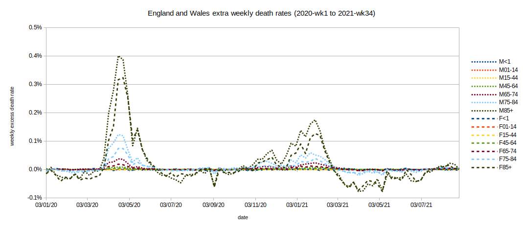
Graph of death registration rates above or below the baseline rates for each week (week 1 2020 to week 34 2021).
- Interpretation note: in week ending 17 Apr 2020 (week 16 of 2020) the deaths of 0.40% of men aged 85 or over were registered in excess of the expected rate for that week (0.31%, we normally expect about 0.3% of men aged 85+ to die each week at that time of year). The deaths of a total of 0.71% of men aged 85+ were registered that week.
- By combining the excess death registration rates with population projections we can derive numbers of deaths. We then find that about 68,000 more people than average died in 2020
- ONS reports that 86,000 death registrations mentioned Covid - a considerably higher number.
- The UK Government dashboard reports 70,196 deaths 'within 28 days of a positive test' in England and Wales in 2020.
- The disparity in numbers between ONS and the UK Government dashboard may be explained by the certifying doctor suspecting Covid, but not having the results of a test available.
- At first look it seems that of the 86,000 death registrations where Covid was mentioned on the certificate, about 18,000 (86,000 - 68,000) were expected that year.
- But what of the apparently unexpected 68,000 people's deaths?
- As in normal times we find the vast majority of deaths among the elderly or otherwise infirm.
- If we analyse 2018 and 2019 data and compare it with the 10-year (2010-2019) average we find that from May 2018 to the end of 2019 about 20,000 fewer people died than expected.
- By definition an average is made up of some higher and some lower figures; in this case the year and a half prior to 2020 featured lower numbers of deaths than average.
- If we consider that about 20,000 frail people avoided dying in the period just prior to 2020 then the excess death toll due to the pandemic etc in 2020 can be reduced to about 48,000 people - a huge number, but it's in the range of pandemic 'flus of 1957 and 1968, not the likes of 1918.
- To try to keep things in perspective, we normally have about half a million deaths in England and Wales each year.
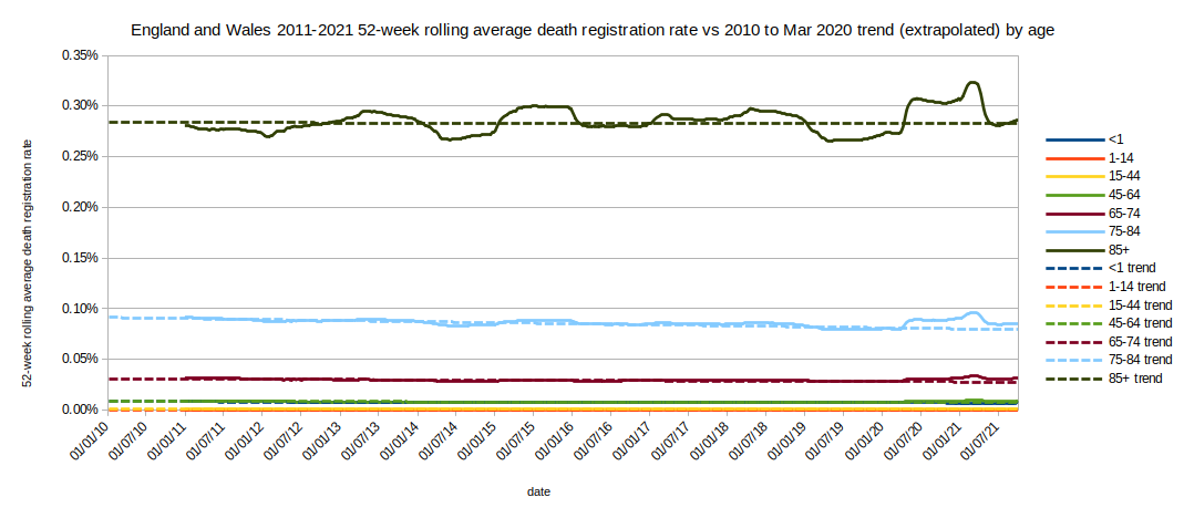
Graph of 52 week rolling average death registration rates per week compared with 2010 to March 2020 trend by age group
- Interpretation note: the graph shows that in the week ending 17 Apr 2020 (week 16 of 2020) the 52 week average of death registration rates for over 85s became greater than the long-term (10-year) trend. This was the peak of the first epidemic. The rapid rise in death rates at that time counteracted the low rates over the majority of the preceding year.
- In a similar way we can see that in the week ending 23 Jan 2015 (week 4 of 2015) the 52 week average for over 85s became greater than the long term trend. Again, a rapid increase in death rates counteracted low rates over most of the preceding year.
- In contrast, the increase in 52 week average death registrations around Winter 2017-2018 was much more gradual - there was no dramatic peak driving a sharp change in the average.
- A steep increase in the 52 week average indicates a sudden very sharp increase in death registrations.
- ONS attributed the sharp Winter 2014-15 increase in death rate to an unusual 'flu epidemic. The slower Winter 2017-18 increase is attributed to unusually cold weather that year ('The Beast from the East').
- Overall we can see that periods of low death rates are followed by periods of high death rates.
- The above analysis highlights something commonly referred to as the 'dry tinder' effect where frail people survive longer than statistically usual and then many die due to suddenly adverse conditions. Of course, every death is upsetting for family and friends but statistics is blind to this.
If we zoom in on the first epidemic wave (weeks 10-26 2020) we can see the age distribution more clearly.
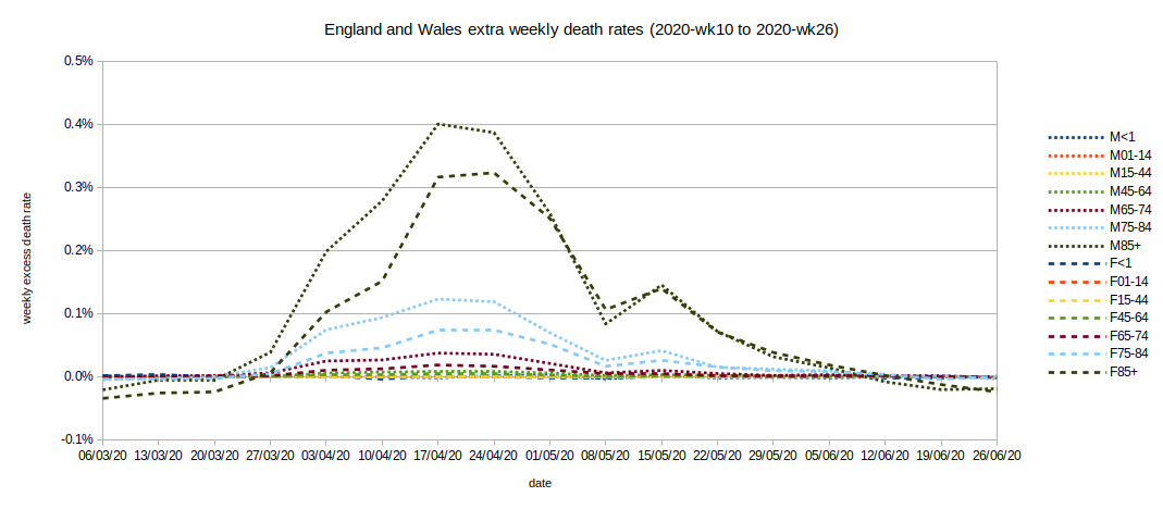
Graph of death registration rates above or below the 'expected' rate for each week (weeks 10-26 2020).
- Note the dip in the graph in week 19 (week ending 8 May 2020) - but we know there isn't actually a dip in the number of deaths occurring during this epidemic wave from the previous analysis of figures. The dip is probably due to register office closures for the Early May Bank Holiday.
- All sex and age groups that show a peak have the peak at week 16-17 (weeks ending 17 and 24 Apr 2020). From the previous analysis we know that the overall peak in death occurrences was around 8 Apr 2020; Death registrations were therefore lagging behind occurrences by about 9-10 days at this point in the epidemic.
- There is almost no observable increase in death registration rates among those aged under 65 (at this scale).
- As expected, males seem to have higher death rates than females.
- Also as expected, the older age groups have a greater increase in death rate than younger groups.
If we plot the weekly rates as cumulative rates we get...
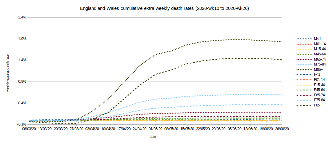
Graph of cumulative death registration rates above or below the 'expected' rate for each week (weeks 10-26 2020).
...Gompertz (natural epidemic) curves for all sex and age groups 45 years and over! OK, you can't actually see the 45-64 age groups curves above the baseline. They're very small, too small to see, but they are there. We find the following curves:
Table of Gompertz formulae parameters
| Group | a | b | c |
|---|
| Female 45-64 | 0.0002779 | 1448 | 0.4743 |
| Female 65-74 | 0.0009168 | 3665 | 0.5353 |
| Female 75-84 | 0.003661 | 5479 | 0.5515 |
| Female over 85 | 0.01468 | 19700 | 0.6164 |
| Male 45-64 | 0.0005303 | 1362 | 0.4716 |
| Male 55-74 | 0.001898 | 3152 | 0.5362 |
| Male 75-84 | 0.006047 | 5649 | 0.5671 |
| Male over 85 | 0.01902 | 9095 | 0.5916 |
Where the general formula is: death_registration_rate=a*EXP(-b*EXP(-c*weekno))
and weekno=10 is 6 Mar 2020.
If we look at the four age groups separately we can see how closely the found curves match the excess death registration rates.
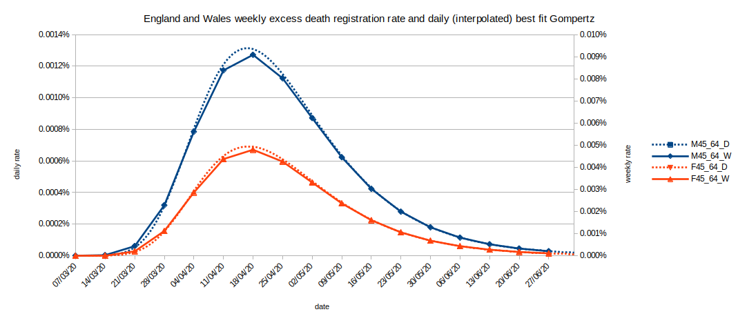
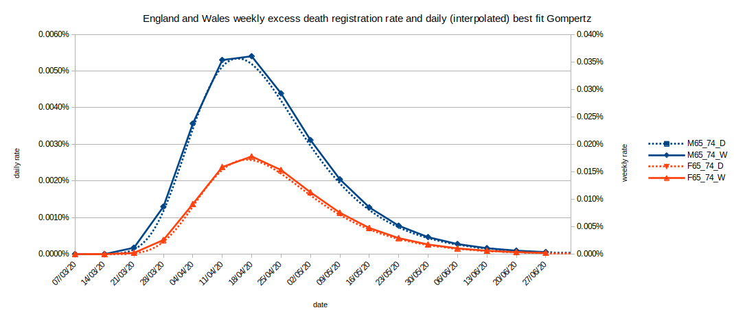
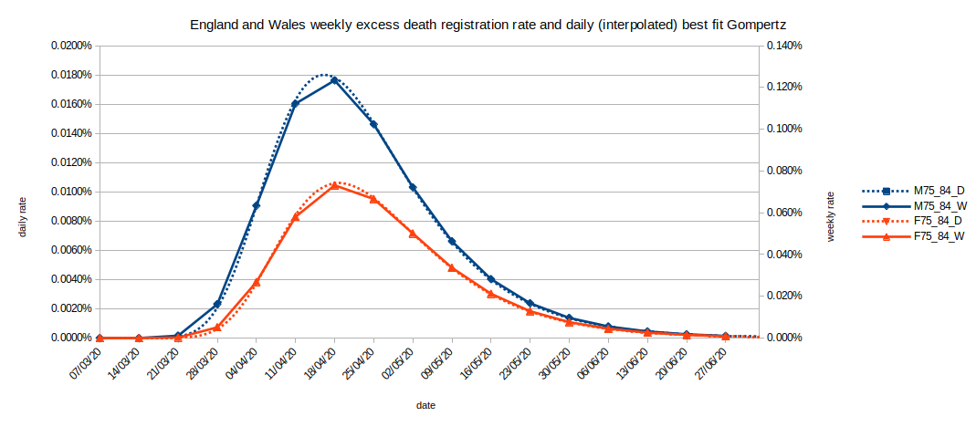
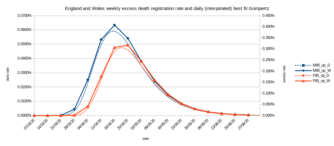
A few things to note:
- The baselines against which the excess death registrations are measured were separately calculated for each sex and age group using the ONS published population estimates and weekly mortality data from 2010-2019. They take into account long term (10-year) trends and annual seasonal variation.
- The excess death registration rate in weeks 10-26 (6 Mar 2020 - 26 Jun 2020) for males is consistently higher than for females in the same age group
- The found peak in excess death registration rate for males is consistently earlier (by a few days) than for females in the same age group
- The peaks in excess death registration rates are in week 16 or 17 (2 weeks ending Fri 24 Apr 2020) for all age groups (over 45) and sexes
- From other data published by ONS the peak in actual death occurrence due to Covid (both sexes, all age groups) is on 8 Apr 2020 during week 15, (week ending Fri 10 Apr 2020). The difference between this single death occurrence peak and the average death registration peaks is the typical death registration delay. Register offices were closed 10-13 Apr 2020 during the Easter holiday - almost directly after the peak in Covid deaths.
It's important to remember that these data are not diagnosed 'Covid' death registrations. These are death registration rates in excess of 10-year expected baselines. The fact that the charts are completely consistent with the analysis based on diagnosed Covid deaths strongly suggests the two approaches are compatible.
Why subdivide the population into age groups or by sex?
- Does this imply that some lives are worth more than others? No.
- Does this have anything to do with Covid-19? Not really.
- The simple answer is that older people are more likely to die than younger people, and males usually die earlier than females. By subdividing the population and analysing the groups separately we can take into account population changes over time.
- An alternative statistical method is to calculate the rates for each sex and age group and then apply those to an agreed 'standard' population (which does not change over time). The result is an Age-Standardised Mortality Rate (ASMR) which can be used to compare between different countries and years. It could be interpreted as 'if our population was like the standard population distribution then we'd have this death rate'.
Slippery statistics warning: Interpreting statistics may not be as straightforward as you imagine.
- The weekly death rate in England and Wales (eg number of deaths per 100,000 people) has been slowly increasing for the 9 years between mid-2010 and mid-2019.
Before you rush off swearing about politicians, bureaucrats, doctors or whatever, you also need to know that over the same period:
- The weekly death rate among all the usual age groups has been decreasing or remained static.
You also need to know that this trend has been going on for a lot longer than a decade.
So how can both statements be true?
Table of weekly death rate trends mid-2010 to mid-2019
| Group | 02/07/10 | 28/06/19 | Change* |
|---|
| All trend | 0.0169% | 0.0174% | 0.0005% |
| <1 trend | 0.0074% | 0.0066% | -0.0008% |
| 1-14 trend | 0.0002% | 0.0002% | -0.0001% |
| 15-44 trend | 0.0009% | 0.0009% | 0.0000% |
| 45-64 trend | 0.0068% | 0.0062% | -0.0005% |
| 65-74 trend | 0.0247% | 0.0227% | -0.0021% |
| 75-84 trend | 0.0784% | 0.0691% | -0.0093% |
| 85+ trend | 0.2723% | 0.2684% | -0.0039% |
- *Note that rounding errors make the arithmetic in the above table look wrong - it's not.
- Over the nine-year period, the average death rate has risen from 0.0169% of the population dying each week to 0.0174%.
- Because more and more people survived to become older the number of elderly people in the population increased.
- The younger population did not increase as much as the elderly population.
- Elderly people die at a higher rate than younger people - even if they are actually dying at a lower rate than people their current age did nine years previously.
- The increase in death rate actually reflects our success in keeping many older people alive longer.
- This change has been developing over many years but it's easily measurable over a period as short as one decade.
Table of population changes mid-2010 to mid-2019
| Group | 02/07/10 | 28/06/19 | Change | %Change |
|---|
| All pop | 55,688,760 | 59,449,321 | 3,760,561 | 6.75% |
| <1 | 706,895 | 655,136 | -51,760 | -7.32% |
| 1-14 | 9,131,684 | 10,065,605 | 933,920 | 10.23% |
| 15-44 | 22,634,600 | 22,485,843 | -148,757 | -0.66% |
| 45-64 | 14,097,507 | 15,236,706 | 1,139,199 | 8.08% |
| 65-74 | 4,785,063 | 5,937,996 | 1,152,934 | 24.09% |
| 75-84 | 3,095,073 | 3,590,394 | 495,321 | 16.00% |
| 85+ | 1,237,938 | 1,477,642 | 239,704 | 19.36% |
In mid-2019 there were 24% more people aged 65-74, 16% more aged 75-84 and 19% more aged over 85 than there were just nine years previously, but there were only 6.75% more people across the whole population.
Because of population changes ONS often releases age-adjusted figures when they present anaysis comparing different years. They're not fiddling the numbers, they're ensuring the figures are not misleading. Indeed, any valid historical comparison of a population must take into consideration any changes to that population.
Please be cautious when reading headline statistics: not all journalists can spot this sort of effect and I think not all journalists would be honest enough to explain it if they did spot it.
Taking population changes into account is essential even when looking at relatively short periods (such as a few years). Failure to do so can lead to very misleading results.
If you wish to comment you may email me at: SoundOfReason0 at gmail dot com. If I append your comment I will not publish your email address.
*We only have population estimates; The State does not maintain an ability to trace and verify the residence of every individual entering or leaving the Kingdom.